
Offensive Pulse: a futuristic cybersecurity website built from one particle field
How offensivepulse.com looks futuristic without hacker clichés: one WebGL particle field that changes shape per section, decoding text and one signal green.
By Alexander Cillán · · 4 min read
On this page· 7
Cybersecurity websites tend to reach for the same props: hooded figures, green code raining down a black screen, padlocks on circuit boards. Offensive Pulse, a certified team that tests web apps, mobile apps, networks and people, needed to look like the future of the field without any of them.
The answer was to borrow from the tools security work actually runs on: radar screens, terminals, technical drawings and targeting overlays. This post looks at how that futuristic, digital look was built, layer by layer.
One particle field behind the whole page
Behind every section sits a single WebGL canvas full of green particles, and it never leaves the screen. As you scroll, the particles scatter into dust and reassemble into whatever the next section is about:
- Hero: a radar, with rings, a centre point and blips that flare up and fade.
- Services: the hairline grid of the six service cards, with bright nodes where the lines cross.
- Process: the board of six stages, with a light that runs along its edge to the active stage.
- Tech Arsenal: a network map of connected clusters.
- AETHER: a planet with a ring, for the team’s own autonomous testing platform.
- Contact: a target, with a bright point at its centre.
A long page becomes one continuous scene. The site feels like a single instrument switching modes, not ten separate sections.
A radar you can read
In the hero, the particles form a radar around the headline. To keep the words sharp, a soft dark shade sits between the particles and the text and dims whatever passes behind it, so the headline always reads cleanly.
Three layers do the work: the WebGL particles at the back, the shade in CSS and the HTML text on top. Each one can change without touching the others.
Text that decodes like a terminal
The small label above the headline doesn’t just appear. For 900 milliseconds it cycles through random letters, numbers and symbols, drawing a new set every 45 milliseconds, and locks in one character at a time from left to right until it reads “Complete cyber threat assessment suite”. Screen readers get the final text straight away.
The same terminal feel runs through the rest of the type. Labels, tags and status lines are set in GT America Mono, in uppercase with wide spacing, next to Suisse Int’l for headlines and reading. The double slash in front of the active menu item and the hero credentials borrows from comments in code.
One green, used like a signal
The palette is a near black, a few greys and one green, #11CE9B, the colour of a lit trace on a screen. The particles, the ticks, the active states and the second line of the headline all share it, so green always means “this is live”.
The logo works the same way: a circle that breaks into a checkerboard of pixels on one side, like a signal turning digital.
Hairlines, corner ticks and machines that report back
Sections sit on hairline grids, with a small green tick at every corner and crossing, like the marks on a technical drawing or a targeting overlay. It gives a dark page structure without heavy boxes.
On top of that grid, each service has an isometric line drawing that runs its routine when you point at it, while a status label in the corner narrates each step. The scanner goes from standby to “scanning · 40%” to match, and the lock from locked to “picking · pins 3/5” to unlocked. It reads like a machine reporting back.
Futuristic, and still fast
Effects like these only work if the page stays smooth. The whole site shares one particle canvas instead of drawing one per section, and the scene behind it is a separate file that loads once the page is idle, after a quick check of the device.
Visitors who prefer reduced motion, use data saver or a slow connection, or browse on a phone with little memory or processing power get a lighter radar drawn in CSS instead, with rings, a sweep and blips, and the rest of the page exactly as it is. Devices that do get the particles run them at one of two quality levels, depending on their graphics chip and processor.
The site is in English and Spanish, and on a phone the services stack into single cards whose routines play as they scroll into view.
Frequently asked questions
How do you make a website look futuristic without clichés?
Borrow from real instruments instead of films. Radar screens, terminals, technical drawings and status readouts feel advanced because people already trust them. On Offensive Pulse that means particles that form a radar, labels that decode and hairline grids with corner ticks.
Does a WebGL background slow a website down?
It can, so load it only where it runs well. Offensive Pulse uses one particle canvas for the whole page instead of one per section, and falls back to a CSS radar on slow connections, on low-powered phones and for anyone who prefers reduced motion.
Which fonts suit a futuristic tech website?
A clean sans for reading and a monospace for labels. Offensive Pulse pairs Suisse Int’l with GT America Mono: the sans keeps long text easy to read, and the mono, in uppercase with wide spacing, gives tags and status lines the feel of a terminal.
Keep reading
Article · October 28, 2026 · 4 min read
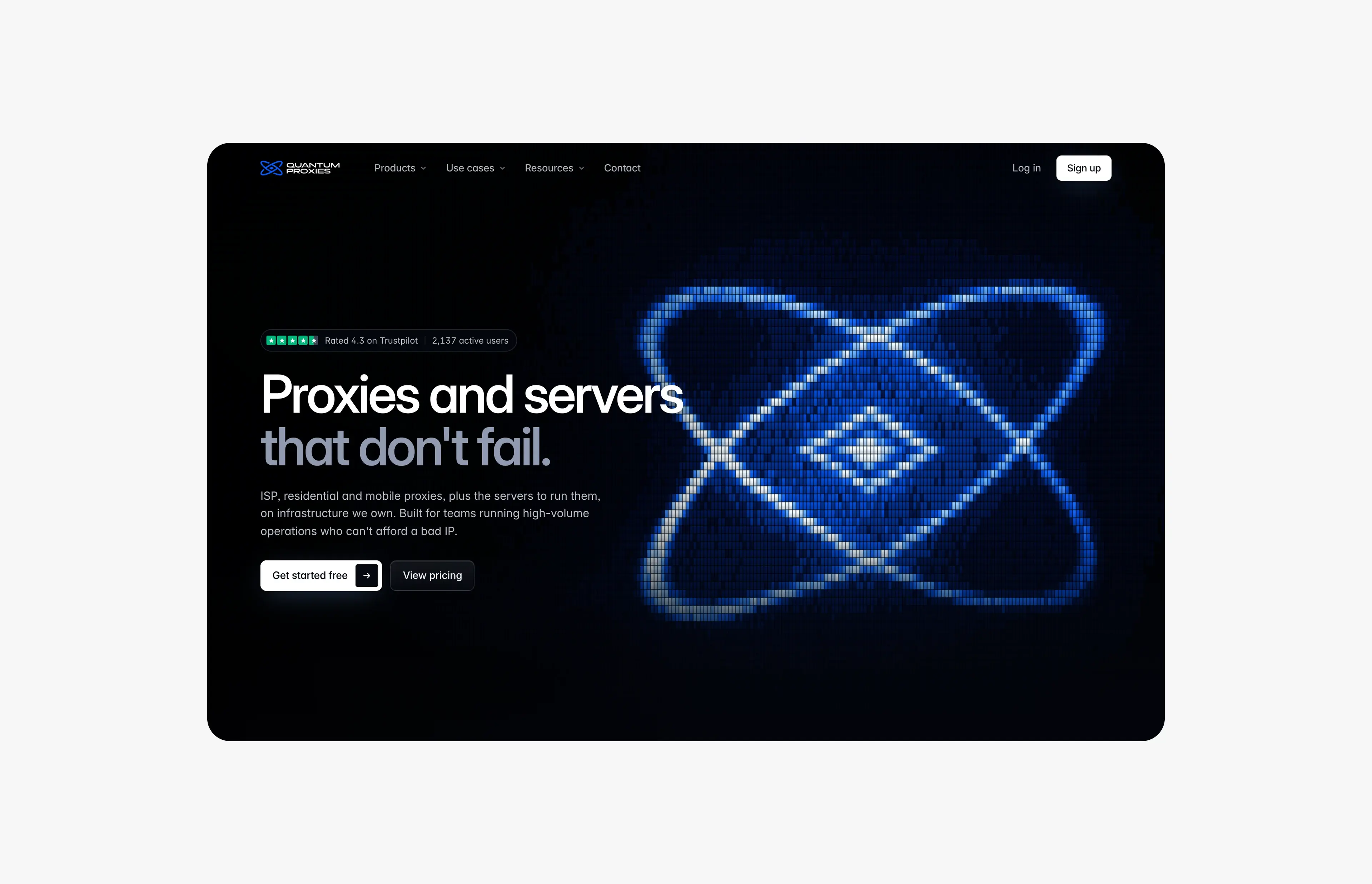
Designing Quantum Proxies: LED light, glass and one camera
The design of quantumproxies.net: an LED hero that lights up under your cursor, glass panels, 3D renders that read as one family and a map you can explore.
Article · September 9, 2026 · 5 min read
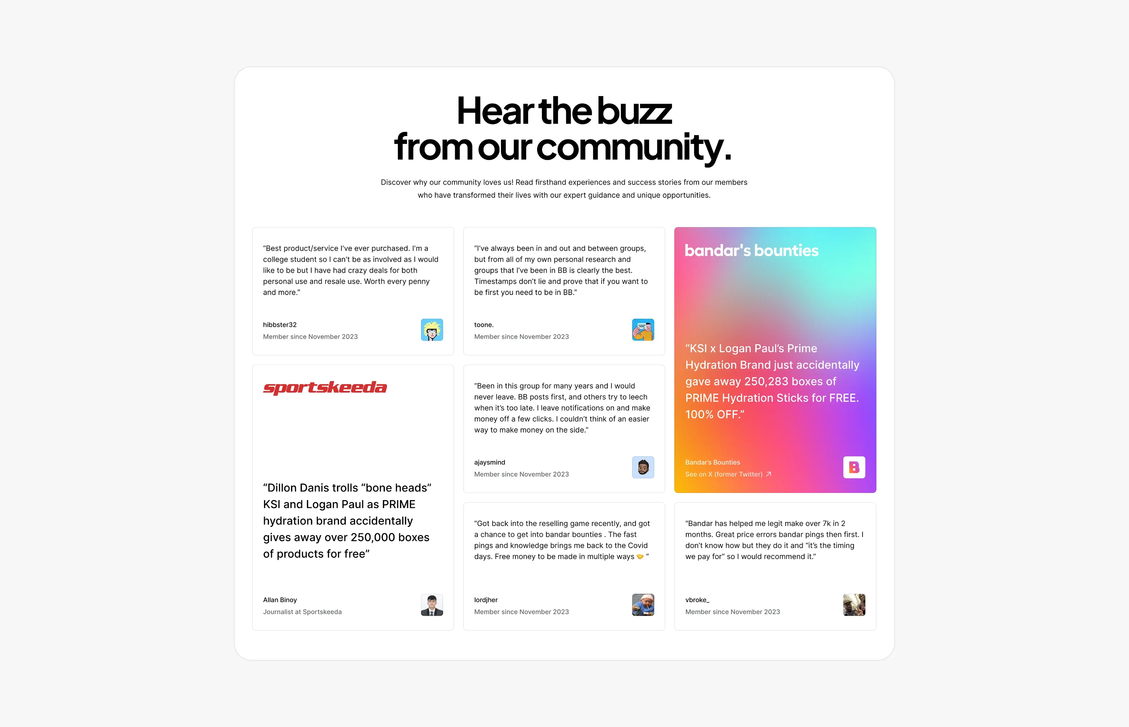
Social proof that converts: designing testimonial and press sections
How to design testimonial, review and press sections that build trust and convert, with real examples from Bandar’s Bounties, Timepiece FNF and Privee Transfer.