
Social proof that converts: designing testimonial and press sections
How to design testimonial, review and press sections that build trust and convert, with real examples from Bandar’s Bounties, Timepiece FNF and Privee Transfer.
By Alexander Cillán · · 5 min read
On this page· 9
Nobody believes a company that says it’s great. People believe other people. That’s why social proof, from testimonials and reviews to press mentions and real results, is often the section that decides whether a visitor books, buys or leaves.
It’s also one of the most carelessly designed sections on most websites: a carousel of anonymous quotes at the bottom of the page, if it’s there at all. Here’s how I design social proof that actually does its job, with examples from Bandar’s Bounties, Timepiece FNF, Privee Transfer and ChromaAI.
The kinds of social proof, and what each one proves
Different proof answers different doubts. Before designing anything, work out which doubt your visitor has:
- Testimonials answer “Will this work for someone like me?”
- Press mentions answer “Is this legitimate?”
- Numbers, like customers served or projects delivered, answer “Is this established?”
- Client logos answer “Who else trusts them?”
- Real results and examples answer “What will I actually get?”
- Ratings and reviews answer “Is the experience consistently good?”
Most sites need two or three of these, placed where each doubt comes up, rather than all of them stacked in one block.
Bandar’s Bounties: authenticity plus credibility
Bandar’s Bounties is a premium Discord community that helps members find online price errors and exclusive deals. It’s the kind of offer people are naturally skeptical about, so the site had to earn trust quickly.
The testimonials section mixes two types of proof on purpose. Real member stories bring authenticity: people like the visitor, in their own words. Highlighted press articles bring credibility: outside sources confirming it’s real. Together they cover both doubts at once, under a headline that frames the section as the community talking, not the brand.
Trust starts even earlier, in the hero. Instead of only promising results, it shows real examples of past wins, so the first thing a visitor sees is evidence rather than a claim.
Timepiece FNF: social proof for high-value decisions
When someone is buying or selling a luxury watch, the stakes are high and so is the doubt. For Timepiece FNF, a group with a strong record of verified sales, the testimonials are designed like the rest of the brand: portrait photos and quote cards on black, with the same restraint as the product pages. Real faces matter here. A quote with a name and a photo is much harder to dismiss than an anonymous line of text.
Placement matters just as much. Testimonials also appear on the sell-your-watch page, next to the four-step process, at the exact moment a seller is deciding whether to trust the team with a valuable watch. Proof is most useful right beside the decision it supports.
Privee Transfer: let the headline frame the proof
Privee Transfer’s reviews section opens with “Trust built ride after ride”. It’s a small detail, but it changes how the quotes are read. Instead of a generic “What our clients say”, the headline tells you what the proof means: consistency, trip after trip. Then two customer quotes, given plenty of space on black, do the rest.
Two strong testimonials with room to breathe beat ten crammed into a slider. For a private transfer service whose fleet runs from vans to a helicopter, fewer and better also matches the brand.
ChromaAI: numbers and named stories together
For a SaaS product, the doubt is often “Do real people use this?” On the ChromaAI website, I combined a testimonial card that pairs a quote with a portrait and a company name, and a bold stats block headed “See why Chroma AI is winning”. The stats give scale at a glance; the testimonial gives one specific, human story. Each makes the other more believable.
Anatomy of a testimonial that converts
- A real name and a face. A full name, or a first name plus company, with a photo or logo. Anonymous quotes read as invented.
- Context. Role, company or what they bought, so visitors can tell whether the person is like them.
- A specific outcome. “Saved me hours every week” beats “Great service!”.
- Short. Two or three sentences. Trim long quotes, with permission, and link to the full story if there is one.
- One highlighted phrase. Bold the key line so people who skim still get the point.
- Consistent cards. Same size and structure, so no single quote looks out of place.
Where to put social proof
- Near the hero, as a short line, a rating or a strip of logos.
- Next to pricing, where doubt about value peaks.
- Beside forms and checkout, where people hesitate before committing.
- On product or service pages, matched to that specific offer.
- In a dedicated section, for visitors who want to read more.
On mobile, keep proof visible without endless scrolling: one or two quotes per screen, and swipeable cards only when there’s a clear hint that more exist.
Keep it honest
Social proof only works if it’s true. Use real quotes from real customers, with their permission. Don’t change the meaning, don’t invent numbers and don’t show press logos for coverage that never happened. Keep it current too: an old testimonial about a product that has since changed doesn’t help anyone. Visitors are good at spotting fake proof, and once they do, every other claim on the page is in doubt.
For more on how trust and polish work together on premium sites, read my luxury website design principles.
Frequently asked questions
How many testimonials should a website have?
Fewer than you think. Three to six strong, specific testimonials usually work better than a long list. Place one or two where decisions happen, like pricing and forms, and keep the rest in a dedicated section.
Should testimonials include photos?
Yes, whenever the customer agrees. A real face and name make a quote far more believable. If photos aren’t possible, add a company logo, a role or the product they bought for context.
Are testimonial carousels bad for conversion?
Auto-rotating carousels often are, because people miss most slides and can’t read at their own pace. If you use one, let users control it, make it obvious that more slides exist and put the strongest quote first.
What’s the difference between testimonials and reviews?
Testimonials are selected quotes you display on your own site. Reviews are usually collected on independent platforms and include ratings. Reviews feel more neutral, while testimonials let you choose the most relevant stories, so many brands use both.
Keep reading
Article · September 3, 2026 · 3 min read
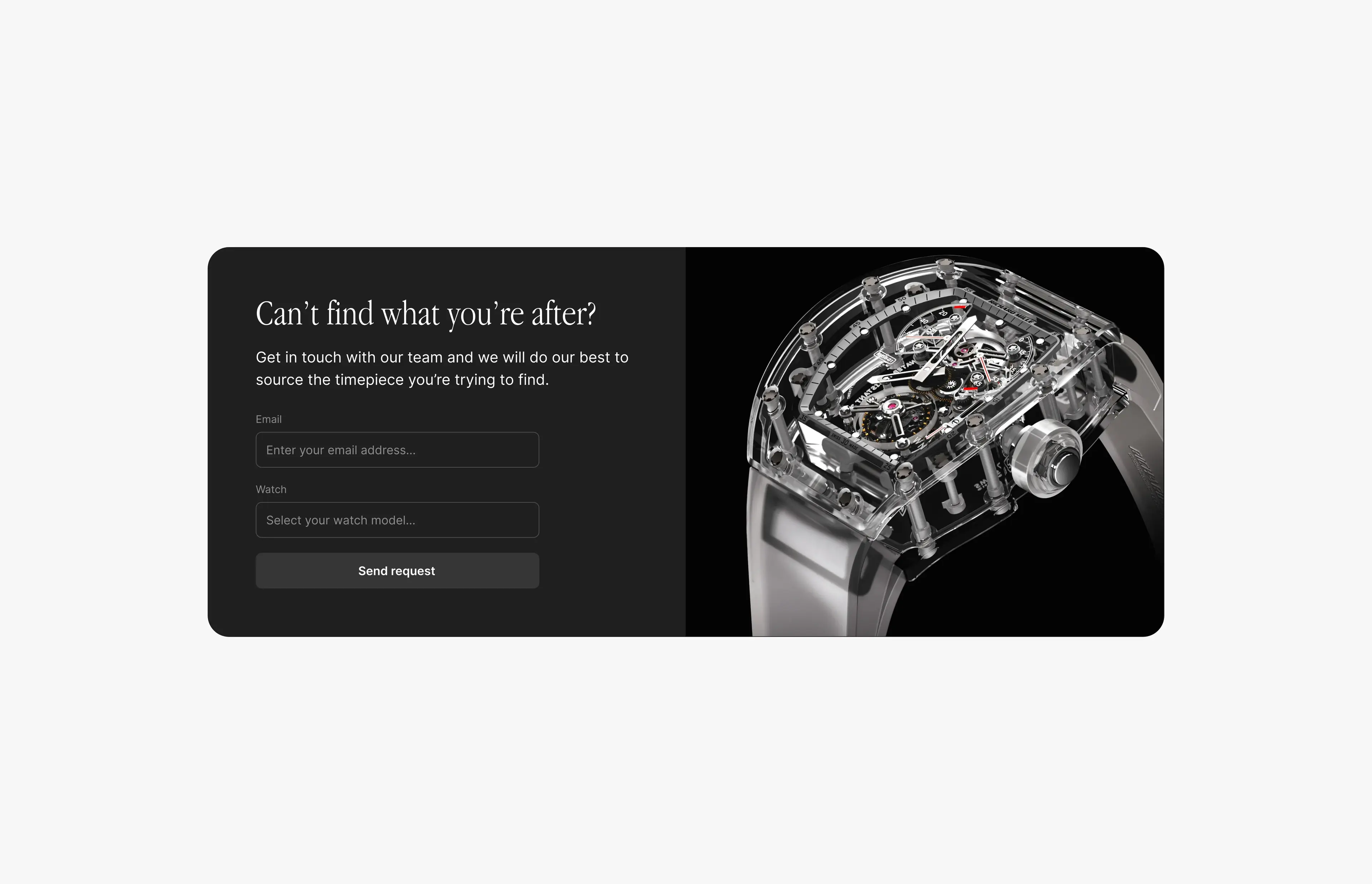
Luxury website design: 8 principles that make a brand feel premium
What separates a luxury website from an expensive-looking template: restraint, typography, photography, pace and trust. Eight principles with real examples.
Article · October 30, 2026 · 4 min read
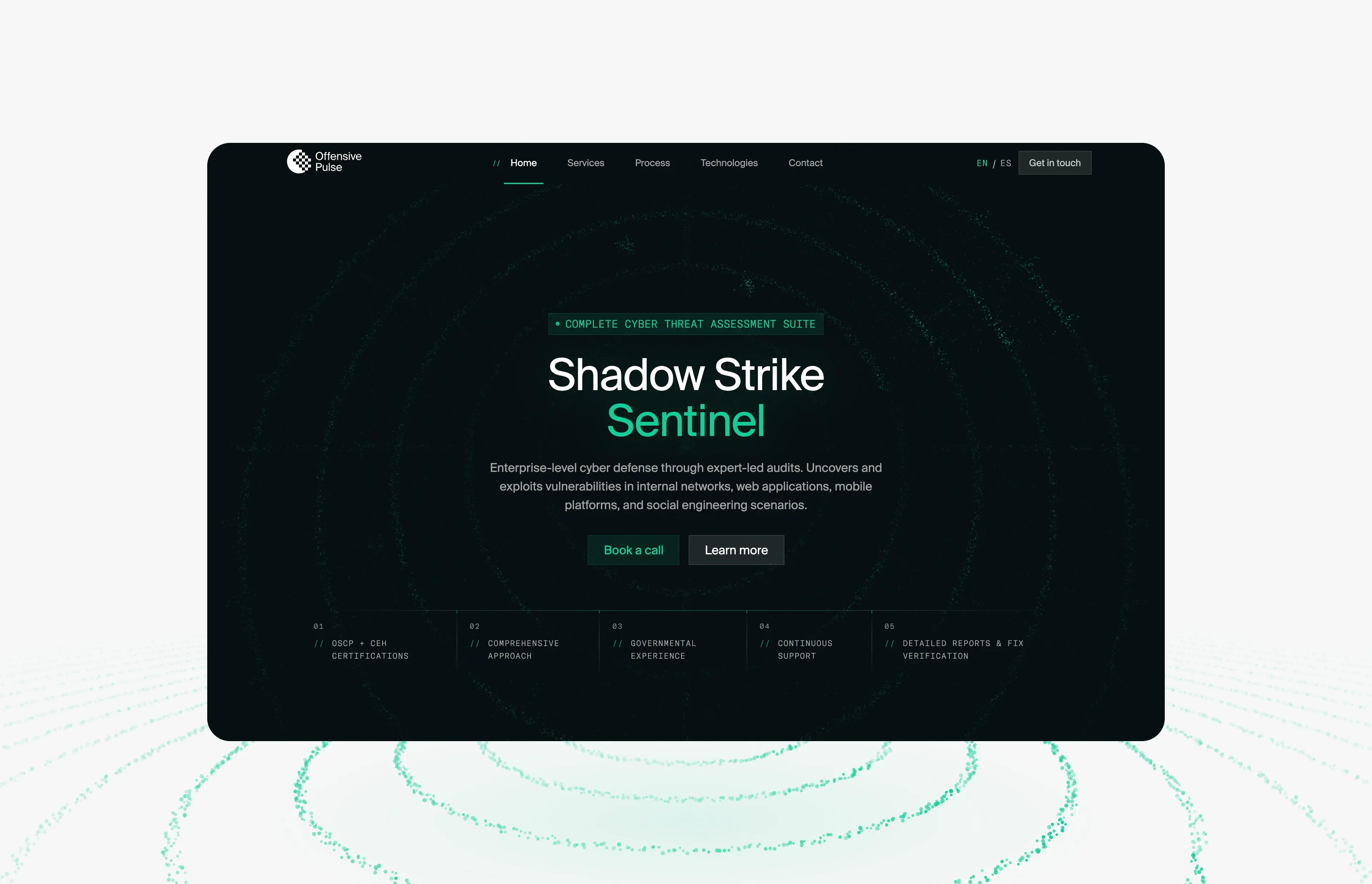
Offensive Pulse: a futuristic cybersecurity website built from one particle field
How offensivepulse.com looks futuristic without hacker clichés: one WebGL particle field that changes shape per section, decoding text and one signal green.