
Designing Quantum Proxies: LED light, glass and one camera
The design of quantumproxies.net: an LED hero that lights up under your cursor, glass panels, 3D renders that read as one family and a map you can explore.
By Alexander Cillán · · 4 min read
On this page· 8
Proxies and servers are invisible products. Nobody ever sees an IP address or a rack in Frankfurt, so the website has to make that infrastructure feel real, fast and owned. That was the design job behind quantumproxies.net, a dark mode only site for a provider of ISP, residential and mobile proxies and the servers to run them.
This post is about the design decisions. How the site was made, with AI and without a single Figma file, is in the case study.
A hero you can play with
The hero has no photo and no illustration. The Quantum mark, two orbits around a core, is drawn in light through a grid of LED cells, rendered live in the browser.
It responds to you. Move your cursor across it and the cells under the pointer light up, with a slight lag that makes the light feel heavy. Scroll down and the grid gets finer, as if the signal is coming into focus. It’s the brand mark and the product idea at once: a signal moving through a network, wherever you point.
One blue, a lot of black
The palette is a near black and one blue, taken straight from the Quantum logo, with lighter tints for highlights and a green for anything live. Instead of hard borders, thin blue hairlines fade out at both ends.
Panels are glass, so each one takes its color from whatever glows behind it. On a dark page full of blue light, that keeps the interface quiet and the product in front.
Type that doesn’t look generated
The first round used an expressive serif for the headlines. The client asked for a plain brand font instead, so every headline is now Inter, in its display cut with tight tracking, with the second line in a softer tone: “Proxies and servers / that don’t fail.”
The small numbered section labels were first set in a monospace, and the client said that font “screams AI”. They were right. The labels now use Archivo Expanded, a wide typeface that echoes the wide QUANTUM PROXIES wordmark. A monospace, Ioskeley Mono, is kept for what it’s for: IPs, code and data.
Making infrastructure visible
Every product has an object of its own: an ethernet plug for ISP, a glass house for residential, a SIM card for mobile, and server units. They’re 3D renders in one material language of dark metal, frosted glass and blue light, so they read as one family.
The servers were the hardest part. The client wanted Dedicated, VPS and Root to look clearly different, so each got its own chassis: open black with the hardware showing, pearl white with a glass top, and brushed silver. All three are seen from exactly the same angle, so they stack into one rack. Point at a unit and it slides out like a drawer.
A network you can explore
Quantum owns its locations, so the map is the proof. It’s a dot map of the world with five locations marked: Frankfurt, London, Paris, New York and Ashburn. Point at any country and it lights up in a ripple from the cursor, arcs trace its routes into all five locations, and a tooltip shows its flag and name. The location cards under the map light up with it.
Every page stays on brand
The product pages and account screens use the same materials:
- Residential proxies: glass homes stand on a blue isometric grid. As the exit IP moves, a light trail jumps from roof to roof and the arriving home lights up.
- Sign in: one open composition instead of boxed tiles, with a 3D “One account” stack and real Trustpilot reviews.
Even the smallest pages get the same light, glass and blue, so nothing on the site feels like a template.
Built for phones too
On a phone the hero stacks with the mark on top, the menu groups proxies and servers, and the map shows the whole world with the details docked underneath. Every heading was checked at phone, tablet and desktop sizes, so no letter ever gets clipped.
Frequently asked questions
What makes a good website for a proxy provider?
Proof and clarity. Show where the network is, what each product is for and what it costs, with real reviews and real numbers. Then give the invisible products a shape people remember, like the renders and the live map on Quantum Proxies.
Should a tech brand use dark mode?
When the product is about networks, data or security, a dark interface lets glows, maps and data read clearly. If you choose it, commit to it: Quantum Proxies is dark only, with no light theme to keep in sync.
How do you keep 3D renders consistent?
Keep one material language, one light color and one perspective across the whole series, so every object reads as part of the same family. On Quantum Proxies, that’s why the three servers stack into a single rack.
Keep reading
Article · October 30, 2026 · 4 min read
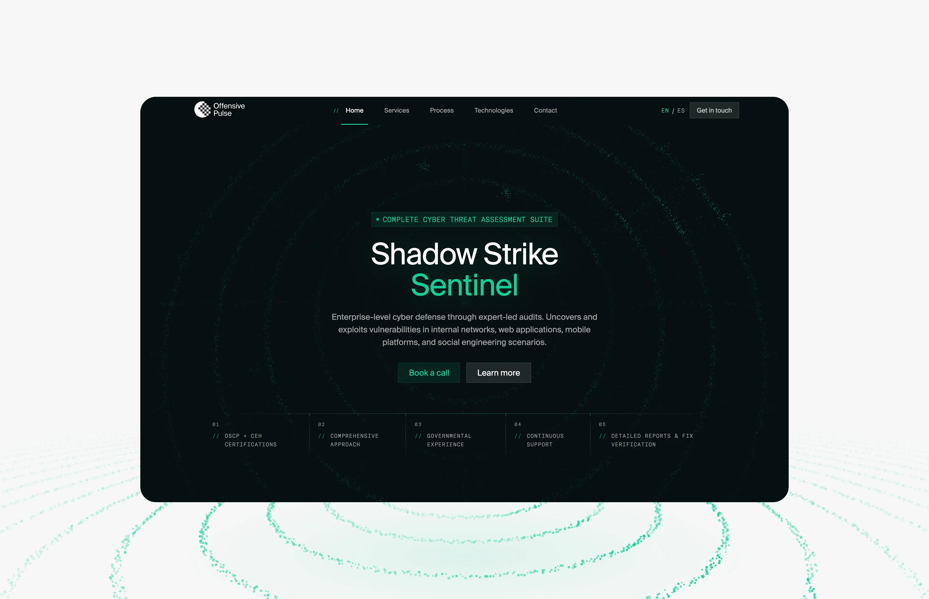
Offensive Pulse: a futuristic cybersecurity website built from one particle field
How offensivepulse.com looks futuristic without hacker clichés: one WebGL particle field that changes shape per section, decoding text and one signal green.
Article · September 9, 2026 · 5 min read
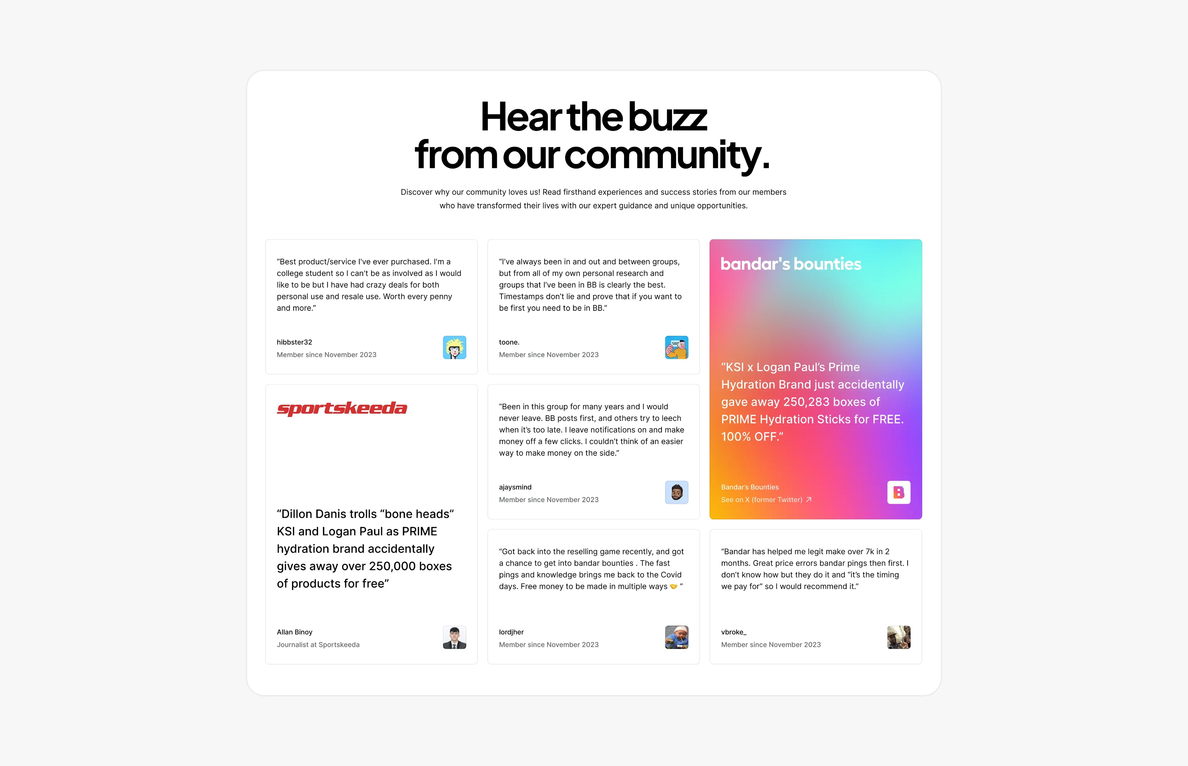
Social proof that converts: designing testimonial and press sections
How to design testimonial, review and press sections that build trust and convert, with real examples from Bandar’s Bounties, Timepiece FNF and Privee Transfer.