
Falx | Cyber Security: a CYBERUK25 stand and lanyard designed to start conversations
How the Falx | Cyber Security stand and team lanyards at CYBERUK25 were designed to draw visitors in, start conversations and turn interest into follow-ups.
By Alexander Cillán · · 5 min read · Updated October 19, 2026
- Client
- Falx | Cyber Security
- Industry
- Cybersecurity
- Services
- Exhibition stand, lanyard and ID card design
- Event
- CYBERUK25, Manchester, booth A27
- Year
- 2025
On this page· 8
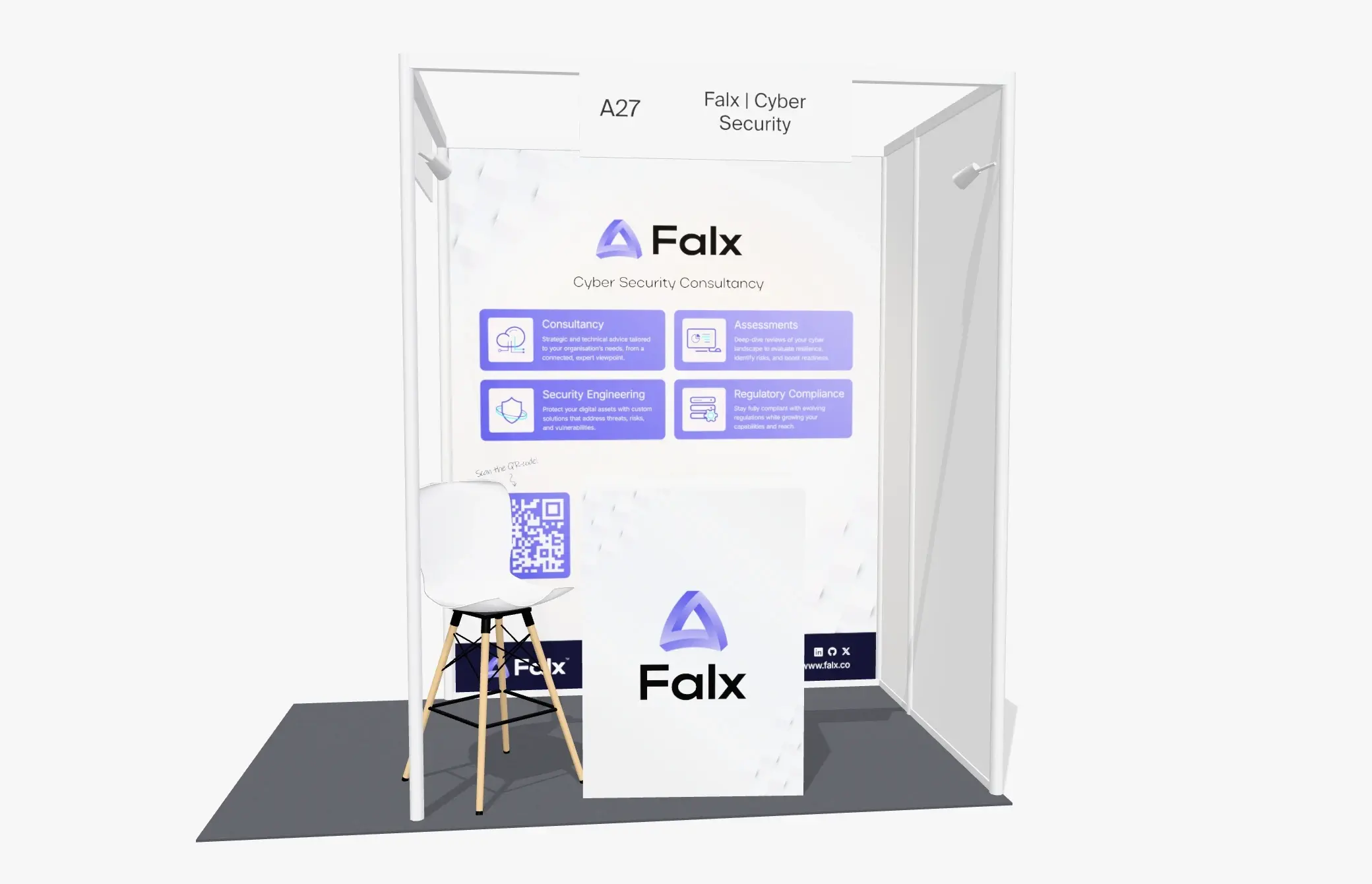
For CYBERUK25 in Manchester, I designed the exhibition stand for Falx | Cyber Security at booth A27, along with the team’s lanyards and entry cards. It was the second time Jared Henderson trusted me with the Falx stand, and that’s the kind of brief I value most: when a client comes back for the next event, the first stand did its job.
At a trade show, design has one job: getting the right people to stop, understand what you do and start talking to you. Every part of the stand and the lanyard was designed around that, from what visitors see across the hall to what they take home.
Engagement starts from across the hall
Most visitors see a stand from a distance first, between other stands and over the heads of other people, and they decide in a few seconds whether to walk over. So the top of the back wall is the Falx logo, large and high, with one line under it: Cyber Security Consultancy. Strong contrast and very few words mean someone can read who Falx is and what they do before they’re close.
Fine detail belongs at eye level, where people are already close enough to read it. If a visitor has to stop and squint to work out who you are, they’ve usually walked on before they find out.
Four services, one question each
Under the headline, the wall lists the four things Falx does as four cards: Consultancy, Assessments, Security Engineering and Regulatory Compliance, each with an icon and a single sentence. A visitor doesn’t have to read a brochure to find the part that matters to them, and once they’ve found it, they usually have a question ready. That question is the start of the conversation the stand is there for.
This matters even more when many exhibitors work in the same field. Plain language is a way to stand out. Credentials and detail can live on screens, in print or, best of all, in conversation with the team.
A QR code that turns interest into a follow-up
Not everyone who’s interested stops to talk. Some are on their way to a session, others want to look you up later. For them, the wall has a QR code at eye level, with a hand-written Scan the QR-code! and an arrow pointing to it, so it reads as an invitation rather than a technical detail. A dark band along the bottom repeats the logo, the website and the social profiles, so the stand keeps working after people have walked past it.
Space for conversations
The goal of a stand isn’t to be looked at. It’s to start conversations. So the front stays open, with nothing between the team and the aisle. A compact counter carries just the Falx logo, marking the brand at eye level without becoming a barrier, and a bar stool lets the team meet visitors at eye level.
The graphics support the people on the stand rather than compete with them. Big messages sit high, and the space at eye level is left for the team.
The lanyard and entry card
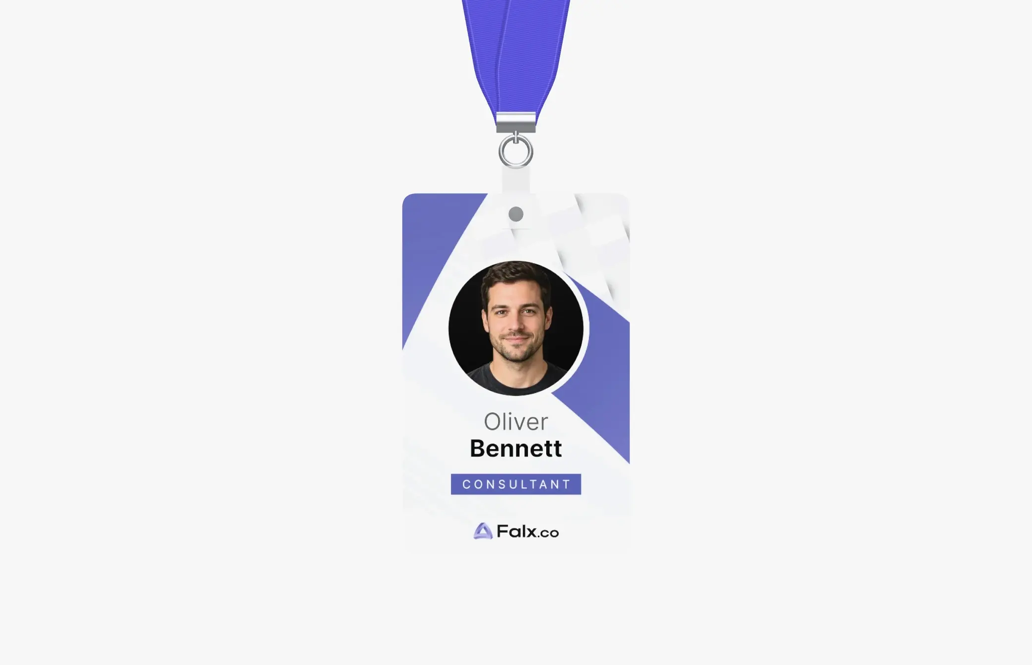
I also designed the team’s lanyards and entry cards. The strap is woven in the purple of the Falx logo. The front of the card puts the photo, the name and the role on the brand’s graphics, with the Falx.co logo at the bottom; the back carries the ownership and validity details, a return address and a QR code.
At a busy event, people talk to people. A branded lanyard makes the team easy to spot, on the stand and anywhere in the hall, and a card with a clear name and role gives visitors an easy way to open a conversation. Because the lanyard follows the same colors, type and logo as the stand, it carries the brand into every room the team walks into.
Consistent with the brand
A stand should feel like the same company as the website, the lanyards, the presentation and the business cards: the same colors, type, icons and tone. When someone scans the code or visits the site after the event, it should feel familiar, which makes the follow-up easier.
For a returning client, consistency also matters from one year to the next. People who saw you last time should recognize you instantly, so I build on what worked rather than reinventing the brand for every event.
Designed for print, at real size
A stand is a print job at a scale most brand work never reaches. I build the files to the organizer’s and printer’s specifications, check contrast for venue lighting, keep important elements away from seams and edges, and leave enough time before the deadlines for proofs. A beautiful design that arrives late or prints badly doesn’t help anyone on the day.
If you’d like to see how I work on brands more broadly, have a look at my case studies.
Frequently asked questions
How does exhibition stand design increase engagement?
By making three things easy: seeing who you are from a distance, understanding what you do in a few seconds, and starting a conversation or a follow-up. A large logo placed high, one clear line, a short list of services, an open front and a QR code at eye level cover all three.
Are branded lanyards worth it at a trade show?
They make your team easy to recognize in a busy hall and on the stand, and a card with a clear name and role gives visitors an easy way to start talking. Designed in the brand’s colors, they also carry the brand beyond the stand.
How much text should go on a trade-show stand?
As little as possible. One short line that says who you are and what you do is usually enough for the large graphics. Detail belongs at eye level, on screens or printed material, and in conversation.
When should you start designing an exhibition stand?
Early enough to leave time for proofs and printing before the organizer’s and printer’s deadlines. Ask both for their dates and plan backwards from them.
Keep reading
Case study · October 5, 2026 · 6 min read
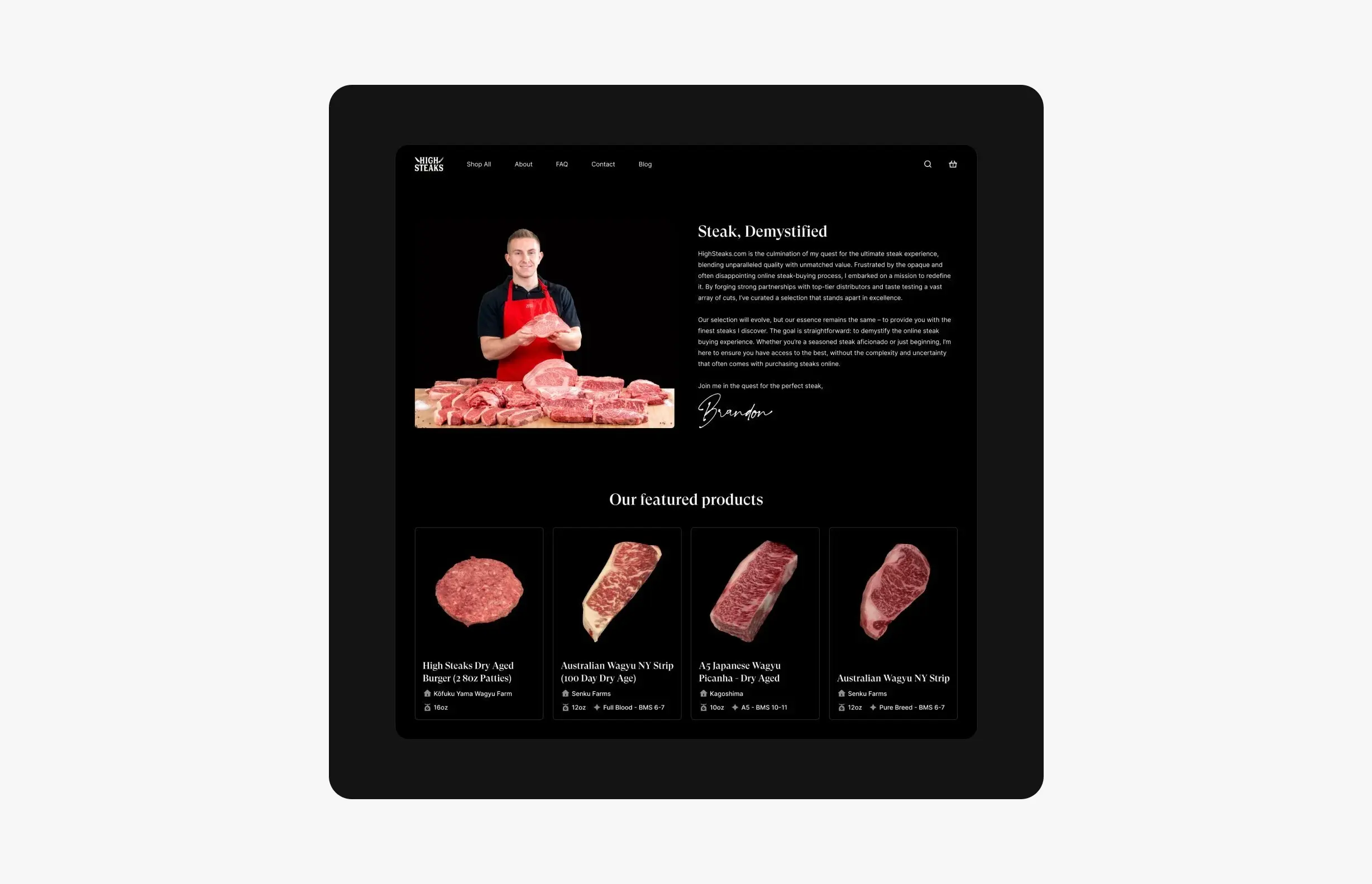
HighSteaks: branding and e-commerce for a creator-led butcher shop
How I refreshed HighSteaks’ knife logo and designed a mobile-first store that turns a New York butcher’s 150K+ social following into online customers.
Case study · September 2, 2026 · 6 min read
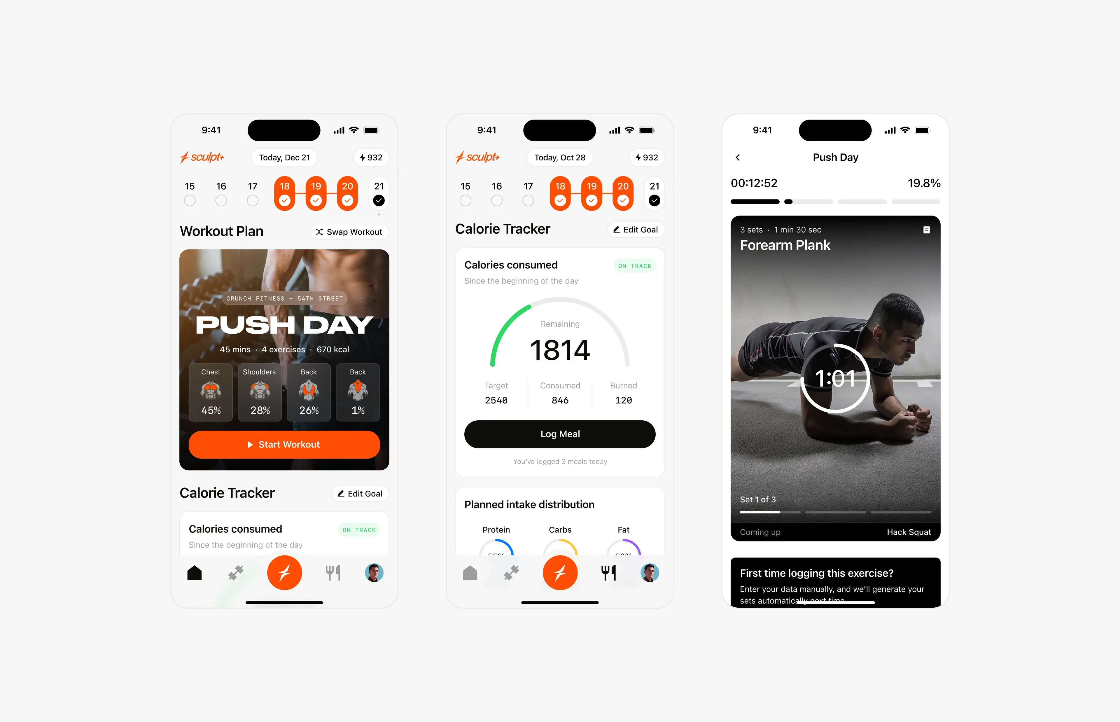
Sculpt AI: brand, motion and 150+ screens for an AI fitness app
How I led the creative for Sculpt AI: a new brand identity, splash motion, a new user flow and 150+ screens for an AI app that unites workouts and food logging.