
HighSteaks: branding and e-commerce for a creator-led butcher shop
How I refreshed HighSteaks’ knife logo and designed a mobile-first store that turns a New York butcher’s 150K+ social following into online customers.
By Alexander Cillán · · 6 min read
- Client
- HighSteaks, premium online butcher shop
- Based in
- New York, United States
- Founder
- Brandon Alwadish, 150K+ followers on Instagram and TikTok
- Industry
- Food e-commerce
- Services
- Logo refresh, e-commerce design, UX design
- Year
- 2024
On this page· 9
HighSteaks is a premium online butcher shop from New York, founded by Brandon Alwadish. Brandon is known for his expertise with premium cuts, and more than 150K people follow him on Instagram and TikTok.
That’s an unusual starting point for an online shop. The audience already exists, and it already trusts the person behind the brand. The challenge was to make the store feel like Brandon: to carry that trust from his videos to the product page, and turn followers into customers. I refreshed the logo and designed the key parts of the online store.
The challenge: a following, not yet a brand
When someone finds HighSteaks, they usually come from one of Brandon’s videos. They know his face, his knives and the way he talks about meat. A generic e-commerce template would throw all of that away the moment they land.
So the brief came down to three things:
- A logo with real personality that still works on packaging and social.
- A store that tells Brandon’s story and shows where the meat comes from.
- A shopping experience built for people arriving from social, on their phones.
Refreshing the logo around Brandon’s knives
The original logo was simple, but it lacked a unique touch. Nothing in it said this is Brandon’s shop.
The new design is built around his favorite knives. Bold typography and knife visuals work together, so the mark feels like it belongs to a butcher rather than a generic food brand. I kept it clean and monochrome so it works anywhere, from packaging to a small profile picture.
Three reasons it works:
- Recognition. Followers already associate Brandon with his knives, so the logo connects with something they know.
- Personality. It reflects the craft and the person, not just the product.
- Versatility. A single color means it reproduces cleanly on packaging and social posts, at any size.
The founder’s story, on the page
In a creator-led brand, the founder is a big part of why people buy. So the About section tells Brandon’s story and ends with his signature, a personal touch that makes it feel like a note from him rather than a corporate page. His photo, enhanced with AI, sits right next to it.
Below the story sit the featured cuts. Each one shows the farm source, the weight and the quality grading, on a clean dark background that lets the meat do the talking. Premium meat is a considered purchase, and these are the details a customer would ask a butcher about across the counter.
Bringing his social content into the store
Brandon’s videos are what built his audience, so they belong in the store too. A dedicated section brings snippets of his Instagram and TikTok content onto the site, bridging his social presence and the shop. Someone who arrives from a video sees the same person and the same tone. Someone who arrives from a search discovers why so many people follow him.
Alongside the content, three value points sum up what the shop offers: a Curated Collection, the promise to Save Time, and the Experience behind it. Short, scannable and easy to take in on a phone.
A cart drawer that keeps people shopping
Every time a shop sends someone to a separate cart page, it interrupts them. On HighSteaks, the cart is a drawer that slides in from the right and dims the page behind it. It shows the items in the cart along with recommended products, and closes with a tap.
Customers never have to leave the page they were on. They can check their cart, add something else and carry on browsing in seconds. The recommendations also give the shop a natural place to suggest another cut, without a pop-up or an extra step.
Mobile-first product cards
Because the audience comes from social, we expected more than 90% of traffic to come from mobile. These visitors are in scroll and shop mode: they’re used to deciding quickly with a thumb, and they won’t pinch and zoom to find a price.
So I designed the product cards for the phone first. The product name, farm source, weight and price are all visible at a glance, so people can compare cuts without opening every product page. It’s the same information they’d see in the featured cuts, in a format built for scrolling.
What it adds up to
HighSteaks now has an identity and a store that feel like Brandon:
- A refreshed logo built on his favorite knives, monochrome and ready for packaging and social.
- An About section with his story and signature, followed by featured cuts with their farm source, weight and grading.
- A social section that connects his Instagram and TikTok content to the shop.
- A cart drawer that keeps people on the page.
- Product cards designed for the phone, where most of his audience shops.
Lessons for creator-led brands
- Build the identity from the creator’s world. Brandon’s knives made the logo personal without turning it into a portrait.
- Let the founder speak. A real story and a signature build more trust than a slogan.
- Connect the feed and the store. Bring the content people already love into the shop.
- Design for the thumb. If your traffic comes from social, the phone is the main experience, not a smaller version of it.
- Don’t make people leave the page. Drawers and inline actions keep the momentum going.
Building a premium brand of your own? I’ve written about the principles that make a website feel premium and what goes into a brand identity. For another premium e-commerce project, see Timepiece FNF.
Frequently asked questions
How do you design a logo for a butcher shop?
Start with what makes the shop different. For HighSteaks it was the founder and his favorite knives, so the logo combines bold typography with knife visuals. Keep it clean and in one color, so it works on packaging, labels and social media.
What should an online butcher shop show on its product cards?
The details that justify a premium purchase: the name of the cut, the farm it comes from, the weight, the quality grading and the price. On HighSteaks the key details are visible on the card itself, so customers can compare without opening every page.
Is a cart drawer better than a cart page?
For most online shops, and especially on mobile, a drawer is the smoother option. It shows the cart without leaving the page, makes it easy to add recommended products and lets people carry on shopping with one tap.
How do you turn social media followers into customers?
Make the store feel like the content they already follow: the same person, the same tone and real snippets of the videos. Then remove friction, especially on mobile, where most of that traffic arrives.
Should an e-commerce site be designed mobile-first?
If most of your traffic comes from social media, yes. HighSteaks expected more than 90% of visitors on mobile, so the product cards were designed to work at a glance on a phone first.
Keep reading
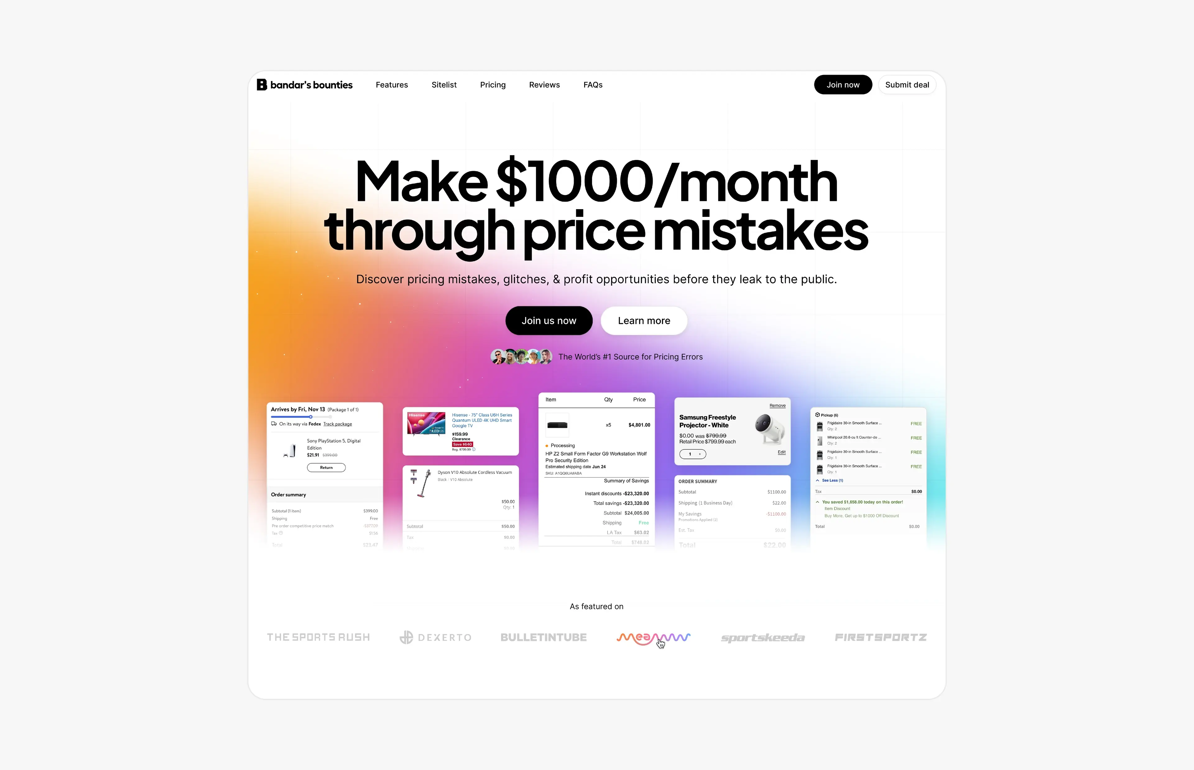
Case study · August 9, 2026 · 6 min read
Bandar’s Bounties: a simpler logo and a website for a price-error community
A one-ink logo and a new website for Bandar’s Bounties, a premium Discord group for price errors: a direct hero, a playful pricing toggle and press proof.
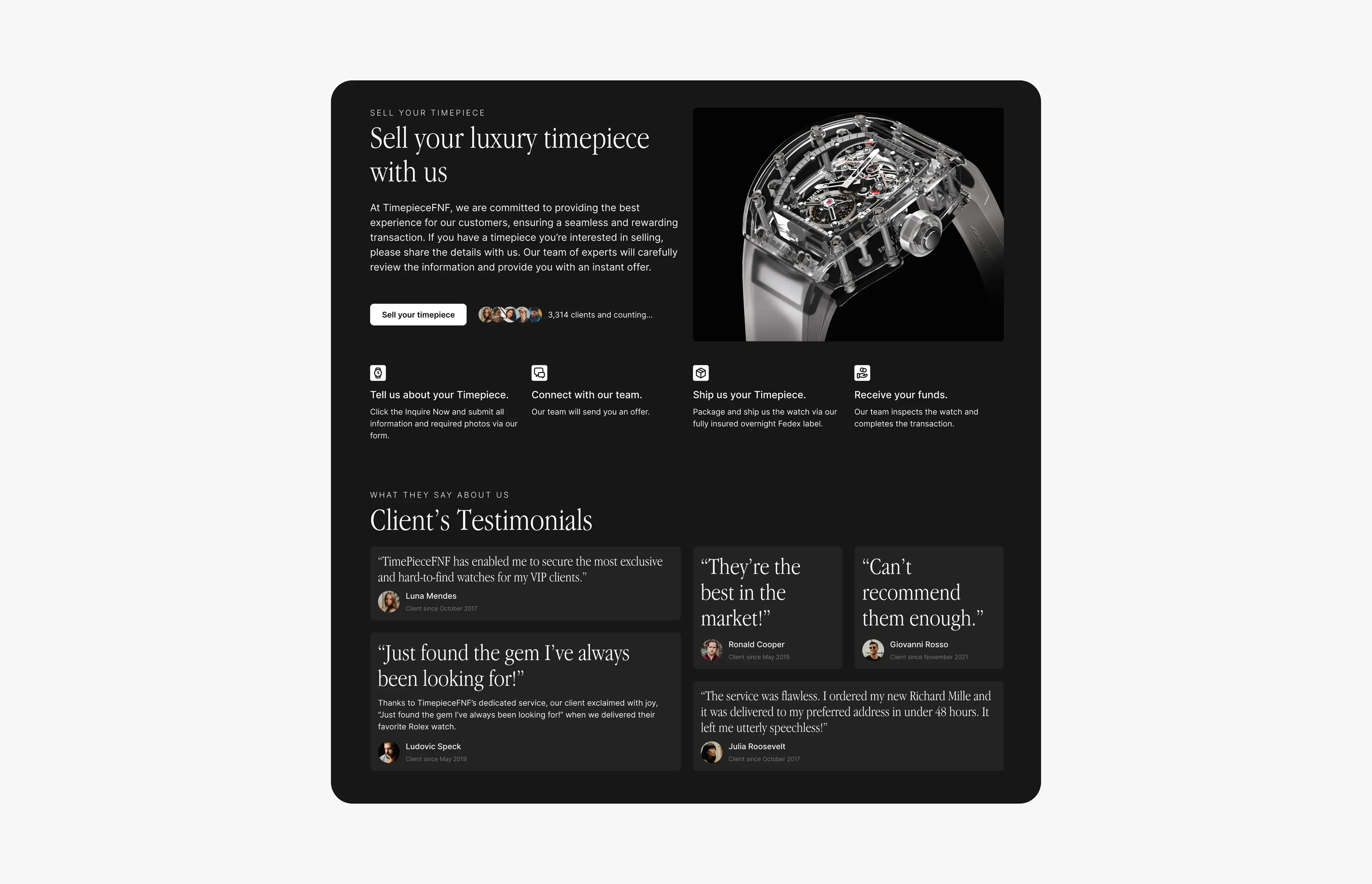
Case study · June 28, 2026 · 4 min read
Timepiece FNF: luxury watch branding, website and a sell-your-watch platform
Brand refresh, a dark-mode website and a multi-step ‘sell your watch’ flow for Timepiece FNF, a luxury watch dealer group with $10M+ in verified sales.