
Sculpt AI: brand, motion and 150+ screens for an AI fitness app
How I led the creative for Sculpt AI: a new brand identity, splash motion, a new user flow and 150+ screens for an AI app that unites workouts and food logging.
By Alexander Cillán · · 6 min read
- Client
- Sculpt AI, AI fitness and nutrition app
- Based in
- United States
- Role
- Creative Director
- Services
- Brand identity, motion design, user flow, UI/UX design
- Platform
- iOS, live on the App Store
- Year
- 2025–2026
On this page· 10
Sculpt AI is a fitness app with a simple promise: bring workout and food logging together in one place, and use AI to make both feel effortless. It takes your training data, nutrition, recovery and the metrics that matter, and turns them into a science-backed plan that adapts to you in real time.
I joined Sculpt as Creative Director in September 2025. I led the creative vision and its execution: a new brand identity, motion for the branding animation and the app’s splash, and a complete rework of the product, with a new user flow and more than 150 UI screens. Sculpt AI is now live on the App Store.
“The mission was clear from day one: to bring workout and food logging together in one seamless app, using AI to make the experience as simple and intuitive as possible.”
The brief: one app instead of three
From the outside, the fitness space looks saturated. Look closer and most apps barely scratch the surface: a workout tracker here, a calorie counter there, a recovery app somewhere else. Sculpt’s team saw that gap and set out to build a lifestyle app that connects all of it.
The goal was ambitious: to create one of the most precise and thoughtfully designed fitness apps out there.
The team had been building since March 2024, and they hadn’t taken shortcuts.
“We spent nearly 2 years building Sculpt AI. 4 complete redesigns. Not tweaks. Full rebuilds.”
Most startups follow the “ship fast, cut corners” playbook. Sculpt kept rebuilding until the product was right, so my job wasn’t to polish what was there. It was to rework the previous version from the foundations up.
Starting with the brand
Before touching a single screen, we built the foundation: a modern, clean identity that could carry a product full of data without feeling clinical.
The mark is a lightning bolt drawn with a quick, forward-leaning stroke, paired with a lowercase sculpt wordmark. It suggests energy and speed, and reduces cleanly to a white symbol on an orange app icon. Orange became the brand’s signature: warm, energetic and easy to spot on a crowded home screen.
Motion for the splash and the logo
A fitness app gets opened again and again, often in the middle of a workout, so the first second matters. I designed the branding animation and the splash visuals together: a spark travels across an orange tile, draws the lightning bolt and writes the wordmark.
The idea is to give the brand a moment of personality when the app opens, then get out of the way. The same animation doubles as a logo sting for social content and launch videos.
A new user flow
The previous version had grown feature by feature. So before redesigning screens, I redefined the user flow: what someone does when they open the app, and in what order.
The home screen answers the two questions people actually have each day: what am I training today, and how am I doing on food? A week strip at the top shows the streak at a glance. Below it, today’s workout is a single card with its duration, number of exercises, estimated calories and the muscle groups it targets, plus one button to start. The calorie tracker follows, with what’s left, eaten and burned.
During a workout, the interface steps back: one exercise, a large timer, the set you’re on and what’s coming next.
Logging food without the friction
Food logging is where many fitness apps lose people: every extra tap is a reason to skip a meal. So the logging flow is built around search and memory: type a food, pick a result with its calories and macros visible in the list, adjust the serving and add it. Your own foods are one tab away, grouped by meal, so logging a breakfast you eat every week takes seconds.
Macros use the same color coding everywhere, so people only learn to read them once.
AI that helps where the decision is
AI sits at the core of Sculpt, so it shows up where it helps: a short note explaining how a portion fits your plan, a reminder of what keeps your streak alive, or a suggestion to increase the weight when your logs show you’ve been at the same load for a while. Each one uses the same small AI Assistant card, so people recognize it instantly.
For open questions there’s a dedicated assistant. You can chat with it or pick a shortcut, like adjusting ingredients or quantities, and it answers with something you can act on: a suggested meal with its calories and macros, ready to log.
150+ screens on one system
The new version came to more than 150 UI screens, covering training, nutrition, the assistant, the profile and flows like adding your gym. At that size, consistency doesn’t happen by accident. Every screen is built from the same parts: the same cards, the same pill buttons, the same macro chips and the same orange for progress and completion.
When a number, a color or a button always means the same thing, people trust what they see, and the team can add features without starting from scratch. I took the same system-first approach on the ChromaAI redesign, and it runs through my SaaS redesign checklist.
Results
- UI screens designed
- 150+
- complete rebuilds of the product
- 4
- from the first build to the App Store
- ~2 years
- for training, nutrition and recovery
- 1 app
What I took from Sculpt
- Build the brand first. A clear identity gave every screen a starting point, from color to tone.
- Fix the flow before the screens. Deciding what people see first, and in what order, solved more problems than any single screen.
- Put AI where the decision is. Small, consistent suggestions in context are more useful than a chatbot alone.
- Rebuilding isn’t failure. Four full rebuilds were the cost of getting it right, and it shows in the product.
More product work is in my case studies.
Frequently asked questions
How long does it take to design a fitness app?
It depends on scope. Sculpt AI was built over nearly two years, with four complete redesigns along the way. The version I led as Creative Director included a new brand identity, motion, a new user flow and more than 150 UI screens.
What makes good UX in a fitness app?
Low effort and trustworthy numbers. People should see today’s workout and their nutrition at a glance, log a meal or a set in a few taps, and get suggestions that fit their data. Consistent components and colors make the numbers easy to read.
How should AI features be designed in a fitness app?
Put them where decisions happen, not only in a chat window. In Sculpt, short AI Assistant cards appear next to foods, streaks and sets, and a dedicated assistant handles open questions with answers you can log straight away.
Does a mobile app need an animated logo or splash screen?
It isn’t essential, but it helps the brand feel alive. A short animation on launch gives the app personality without slowing people down.
Keep reading
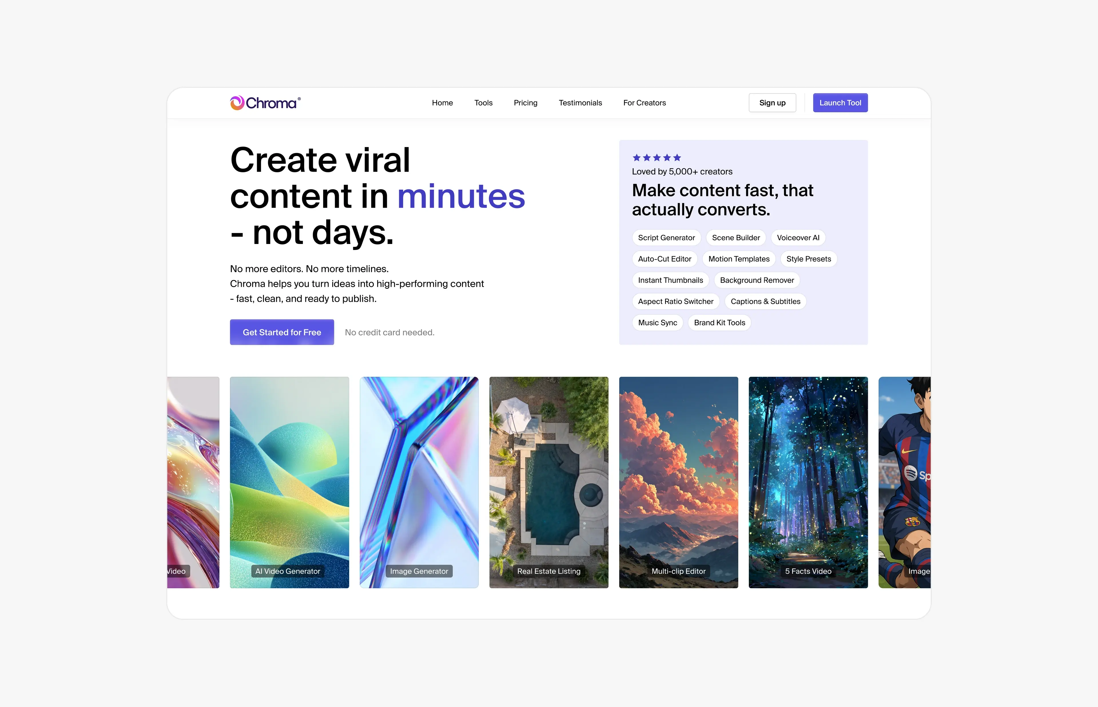
Case study · June 21, 2026 · 5 min read
ChromaAI: redesigning an AI content platform across 100+ screens
How I turned ChromaAI’s MVP into one cohesive creator platform: 100+ redesigned screens, a design system for 10+ AI tools and a 30-second launch video.
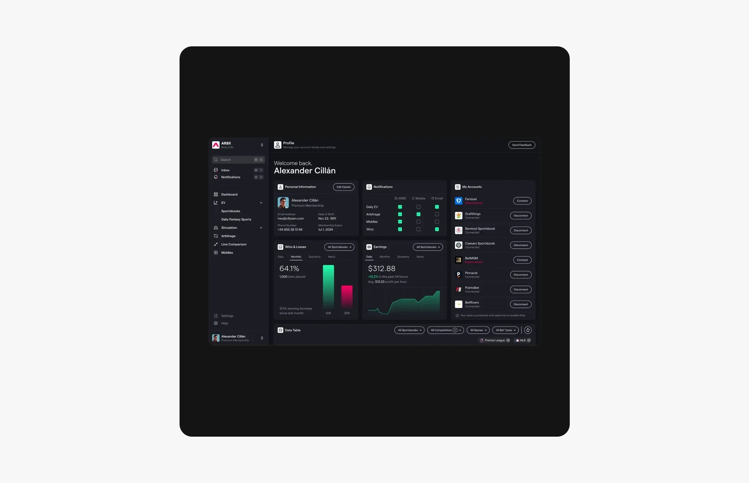
Case study · July 23, 2026 · 5 min read
ArbX: designing a sports analytics dashboard you can read at a glance
How I designed ArbX, a sports betting analytics SaaS: a dark dashboard you can read at a glance, a step-by-step simulator and an animated pricing grid.