
Luxury website design: 8 principles that make a brand feel premium
What separates a luxury website from an expensive-looking template: restraint, typography, photography, pace and trust. Eight principles with real examples.
By Alexander Cillán · · 3 min read
On this page· 9
A luxury website isn’t defined by gold accents or a serif logo. It’s defined by how it makes people feel: calm, confident, and sure they’re in the right place to spend a lot of money.
These are the principles I followed when designing the website for Timepiece FNF, a luxury watch dealer group with more than $10M in verified sales, and the ones I apply to every premium brand.
Say less
Luxury is confident. It doesn’t need to explain everything above the fold. Cut every section that doesn’t earn its place, and give the ones that stay plenty of space. Empty space isn’t wasted: it’s what makes the rest look expensive.
Let typography do the heavy lifting
A refined serif for headlines paired with a clean sans-serif for text instantly signals quality, without decoration. Keep the type scale small, use generous line spacing, and resist the urge to make everything bigger.
Photography leads, the interface follows
The product is the hero. Large, consistent photography with the same light and angle across the catalog does more than any layout trick. The interface around it should be quiet: thin lines, subtle buttons, no competing colors.
A tight palette (and dark mode when it fits)
Two or three colors are enough. For watches, jewelry and other products with metal, glass or gemstones, a dark background makes the product glow and feels exclusive. For fashion or hospitality, warm neutrals often work better. Pick one direction and commit.
Slow, deliberate motion
Animation should feel like a well-made watch movement: smooth, precise and never in a hurry. Gentle fades and reveals beat bouncy effects. And respect visitors who turn animations off in their system settings.
Speed is part of the experience
A beautiful page that loads slowly feels cheap. Compress images properly, serve modern formats, load videos only when they’re about to be seen, and test on a real phone. Fast pages also rank better on Google.
Build trust into every page
People spending thousands want proof. Make authenticity guarantees, testimonials, clear policies and real contact details easy to find. For Timepiece FNF, client testimonials with real portraits sit right next to the call to sell a watch.
Friction only where it adds value
Make every step easy, except the ones that reassure. A multi-step form that asks one thing at a time feels effortless, but asking for the box and papers of a watch is friction that builds trust, because it shows the seller you know what matters.
Frequently asked questions
Should a luxury website be dark or light?
It depends on the product. Dark backgrounds suit metal, glass and gemstones, like watches and jewelry. Light, warm neutrals often suit fashion, interiors and hospitality. Consistency matters more than the choice itself.
Which fonts work for luxury brands?
A refined serif for headlines with a clean, neutral sans-serif for body text is a reliable pairing. What matters most is restraint: few sizes, generous spacing and careful line lengths.
Can a template look premium?
It can get close with great photography and strict editing, but templates are built to fit everyone. A custom design lets the brand’s details, flows and trust signals fit the business exactly.
Does website speed matter for luxury brands?
Yes. A slow page breaks the feeling of quality, and speed is part of how Google ranks pages. Optimized images, lazy-loaded video and a lean page make a premium site feel premium.
Keep reading
Article · September 9, 2026 · 5 min read
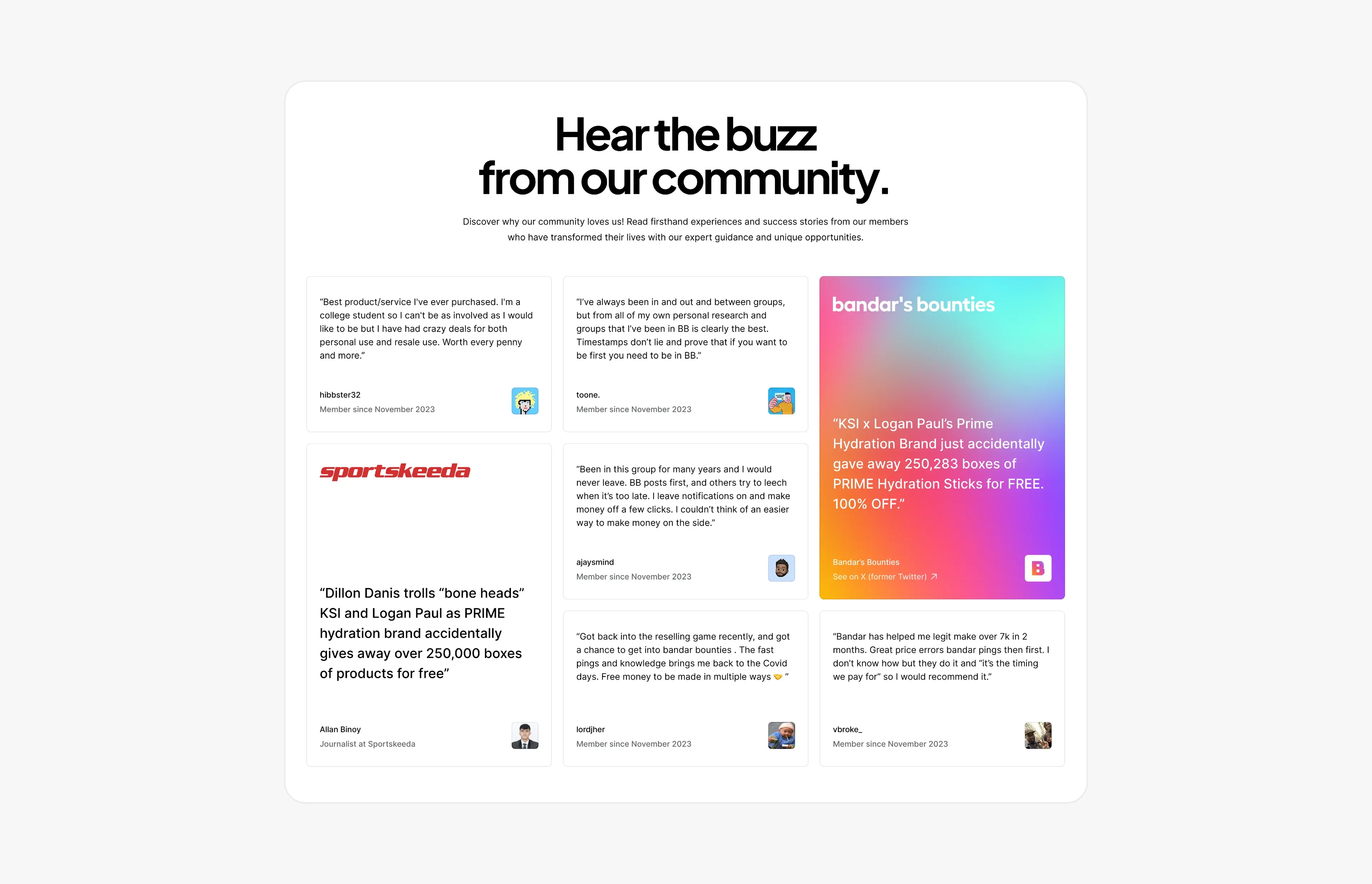
Social proof that converts: designing testimonial and press sections
How to design testimonial, review and press sections that build trust and convert, with real examples from Bandar’s Bounties, Timepiece FNF and Privee Transfer.
Article · October 30, 2026 · 4 min read
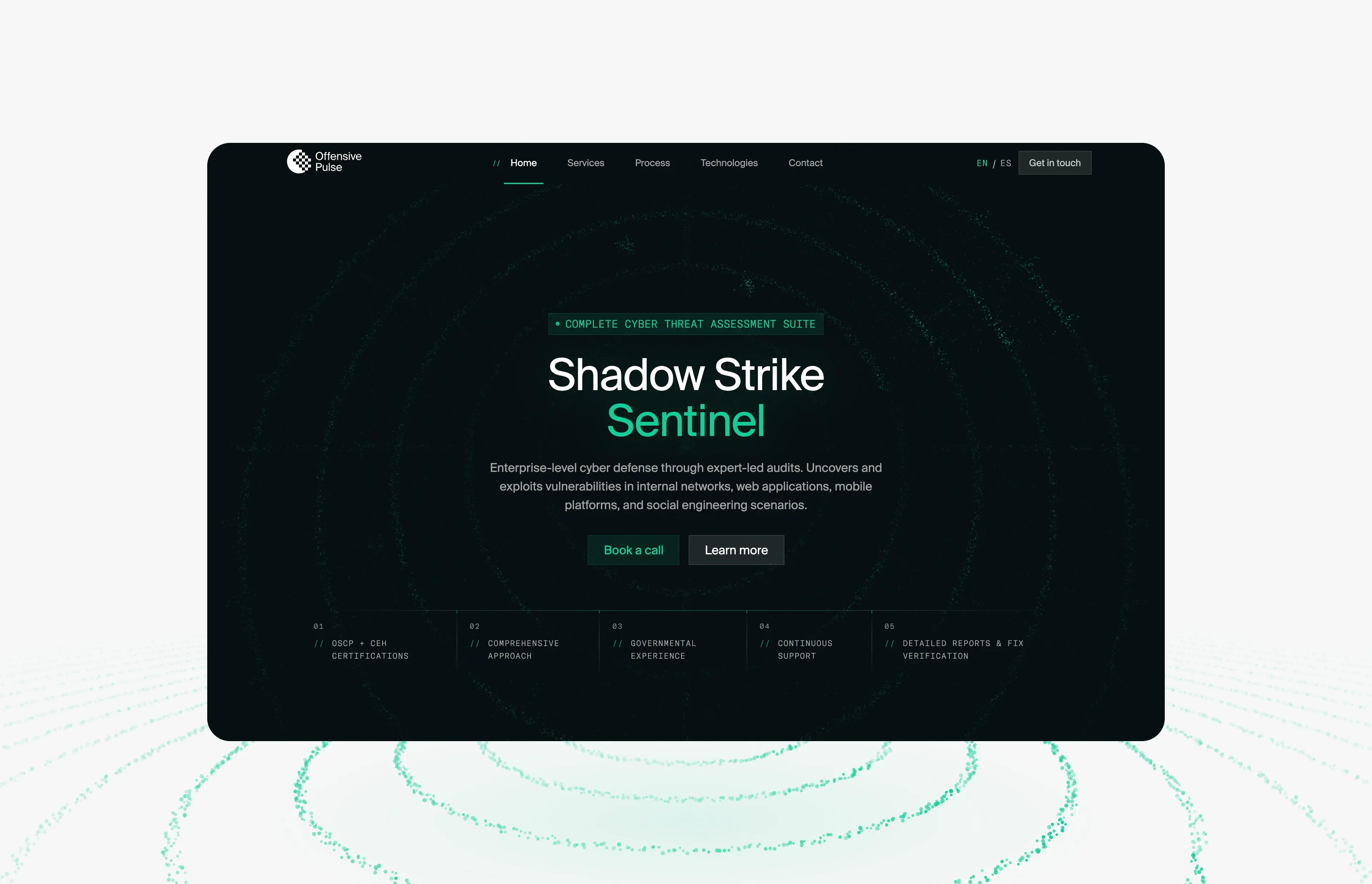
Offensive Pulse: a futuristic cybersecurity website built from one particle field
How offensivepulse.com looks futuristic without hacker clichés: one WebGL particle field that changes shape per section, decoding text and one signal green.