
Timepiece FNF: luxury watch branding, website and a sell-your-watch platform
Brand refresh, a dark-mode website and a multi-step ‘sell your watch’ flow for Timepiece FNF, a luxury watch dealer group with $10M+ in verified sales.
By Alexander Cillán · · 4 min read
- Client
- Timepiece FNF, luxury watch dealer
- Based in
- United States
- Services
- Logo redesign, brand identity, website design, UX design
- Tools
- Figma, Illustrator, Photoshop
- Timeline
- 10 weeks, spring 2024
On this page· 7
Timepiece FNF is a platform for buying, selling and sourcing luxury watches, from Rolex and Patek Philippe to Audemars Piguet and Richard Mille. Behind it is a group with more than $10M in verified sales, a curated inventory of authentic pieces and a reputation for finding any watch, however rare.
The business was premium. Its brand wasn’t. I partnered with the founders on a full visual and UX overhaul across three fronts: the logo and identity, a new website, and a dedicated platform for people who want to sell their watch.
The problem: a premium business with a dated face
In luxury, trust is everything, and the first impression is visual. Timepiece FNF had the network and the track record, but the brand didn’t show it:
- The original logo was overly complex, unbalanced and felt dated.
- The website was cluttered and visually disconnected, with no clear structure.
- Browsing the available watches was hard, and so was submitting a watch for sale.
The brief came down to three things: a cleaner, more professional identity; a dark, elegant website that matched the watches; and a submission flow that collects accurate details without friction.
A sharper, simpler logo
I explored five logo directions. The one we chose is a simplified, geometric version of the original: it keeps the brand’s essence, so existing customers still recognize it, but it’s sharper, more timeless and much easier to reproduce at any size.
The new mark was so well received that it became the base for physical merchandise, including a custom diamond chain. When a client wears your logo as jewelry, the identity is doing its job.
A dark-mode website built around the watches
The website uses a dark, luxurious aesthetic that lets the watches shine. A serif typeface for headlines and a clean sans-serif for body text balance classic and contemporary, the same tension you find in fine watchmaking.
Every page, from the homepage and collections to testimonials, the blog and policy pages, was designed around premium photography and quiet UI details. Nothing competes with the product. And because many collectors browse on their phones, every layout was designed mobile-first.
“Sell your watch”: a multi-step flow for accurate submissions
Buying stock from private sellers is a core part of the business, so it deserved its own platform. The “Sell your watch” flow guides people through one question at a time: the brand, the model, its condition, the box and papers, and photos.
Breaking it into steps does two things. It feels effortless for the seller, even on a phone, because each screen asks for one thing. And it gives the team structured, complete information for a valuation, instead of vague emails that need several rounds of follow-up.
Results
- logo directions explored
- 5
- from kick-off to launch-ready design
- 10 weeks
- in verified sales behind the brand
- $10M+
Timepiece FNF now has a modern, professional, mobile-first presence with a flexible identity system and clear UX patterns across every touchpoint:
- A clean new logo used across print, digital and merchandise.
- A dark-mode website with luxury appeal and curated content.
- Responsive layouts for desktop and mobile.
- A multi-step selling form built for clarity.
- A structured brand architecture across every page.
The redesign didn’t just elevate the brand’s image. It made the platform more functional and trustworthy for new and returning customers.
Designing for luxury: what made the difference
- Restraint. Fewer elements, more space and a tight color palette signal confidence.
- Typography with character. A refined serif for headlines does more for perceived quality than any decoration.
- Let the product lead. Large, consistent photography and quiet UI keep attention on the watches.
- Remove friction where it doesn’t add trust. Make the steps easy, but keep the details that matter to a high-value transaction.
I go deeper into these ideas in luxury website design: 8 principles that make a brand feel premium.
Frequently asked questions
What makes a luxury website feel premium?
Restraint, generous spacing, refined typography and outstanding product photography, with interface details that stay quiet. Speed and polish on mobile matter just as much, because a slow or clumsy page breaks the feeling of quality.
Why use a dark theme for a luxury watch website?
Dark backgrounds make metal, glass and gemstones stand out, feel exclusive and work well with dramatic product photography. It also gave Timepiece FNF a look that’s distinct from mass-market watch retailers.
How should a ‘sell your watch’ form work?
One step per question, in the order a valuation needs it: brand, model, condition, box and papers, then photos. It should work perfectly on a phone and make the next step clear, so sellers finish it and the team gets complete information.
How long does a luxury brand and website project take?
This project took ten weeks from kick-off to launch-ready designs, including five logo directions, the full website and the selling platform. A logo refresh on its own is much faster.
Keep reading
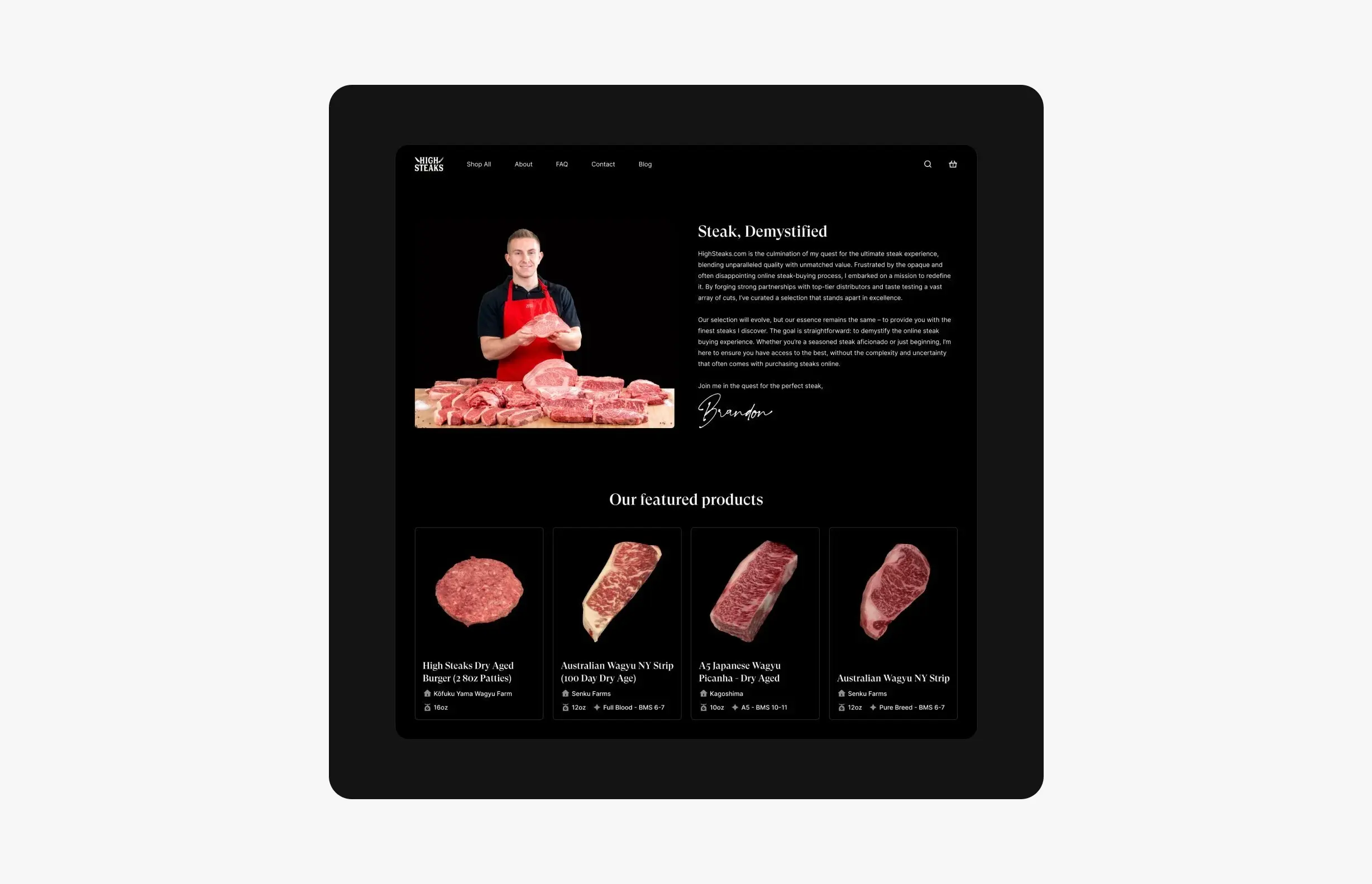
Case study · October 5, 2026 · 6 min read
HighSteaks: branding and e-commerce for a creator-led butcher shop
How I refreshed HighSteaks’ knife logo and designed a mobile-first store that turns a New York butcher’s 150K+ social following into online customers.
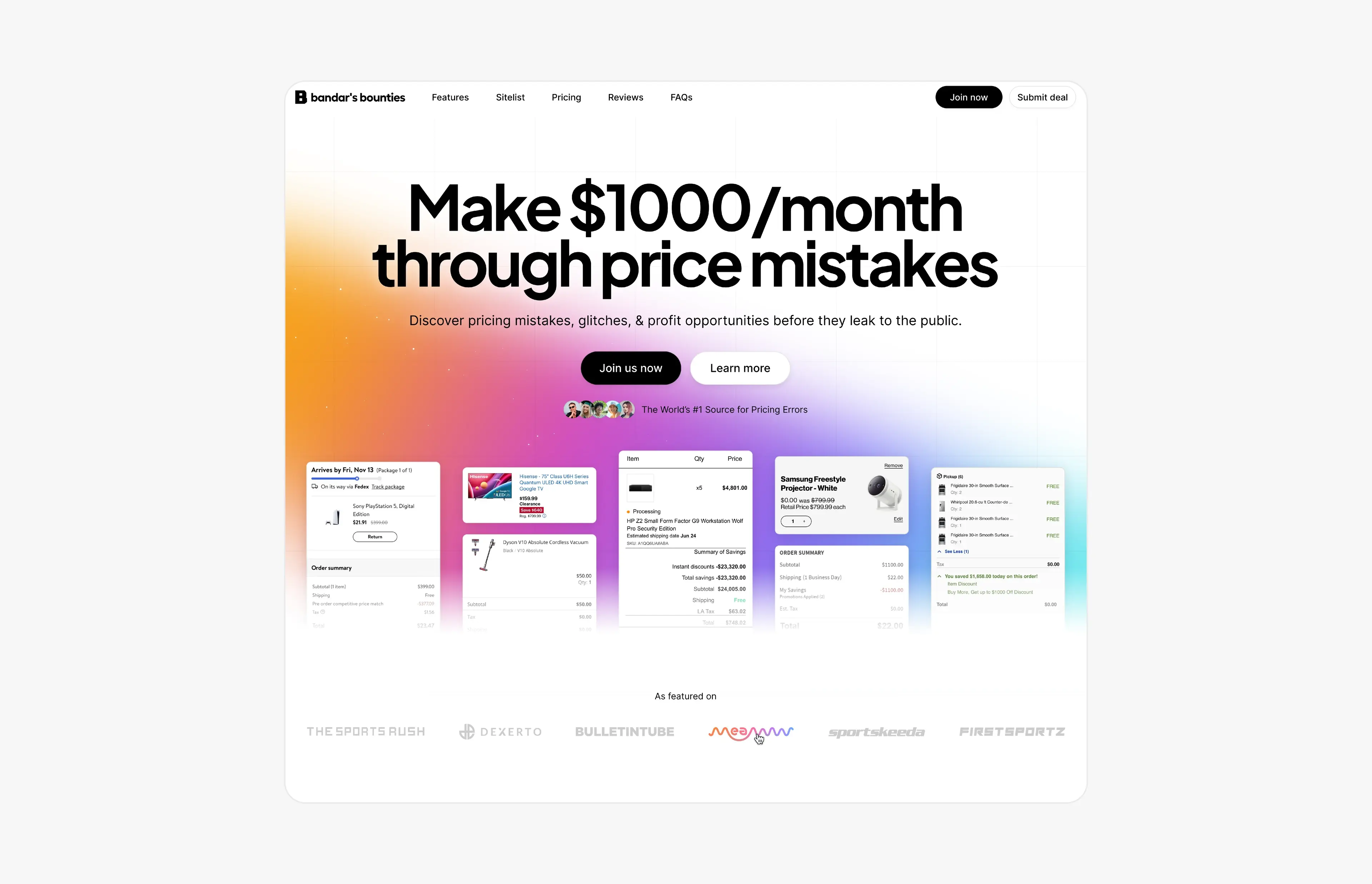
Case study · August 9, 2026 · 6 min read
Bandar’s Bounties: a simpler logo and a website for a price-error community
A one-ink logo and a new website for Bandar’s Bounties, a premium Discord group for price errors: a direct hero, a playful pricing toggle and press proof.