
Redesigning a SaaS product: a 12-point UI/UX checklist
A practical UI/UX checklist for redesigning a SaaS or AI product, from the audit and navigation to states and design systems, based on redesigning 100+ screens.
By Alexander Cillán · · 3 min read
On this page· 6
Most SaaS products aren’t designed. They’re accumulated. One feature ships, then another, each built by a different person under a different deadline, until the product works but feels like a collection of separate tools.
I recently redesigned ChromaAI, an AI content platform, across more than 100 screens. This is the checklist I use on every product redesign, in the order I use it.
Before you design anything
1. Audit every screen and every state
Take screenshots of everything: each page, but also empty states, errors, loading, modals and emails. Put them side by side. Inconsistencies you’d never notice one screen at a time become obvious.
2. Decide what the redesign must achieve
More sign-ups? Fewer support tickets? A product that looks ready for enterprise clients? Write down two or three goals. They’re how you’ll make every trade-off later.
3. Map the core journeys
List the three to five things users come to do, and design those paths first. Everything else can follow the patterns they set.
Structure
4. One layout grammar for every tool
Pick one structure, for example title, input, settings, result, and apply it everywhere. When every tool is laid out the same way, learning one means knowing them all.
5. Navigation that always says where you are
A persistent sidebar for sections, a simple top bar for page actions, clear names that don’t change. Users should never wonder where they are or how to get back.
6. A type scale that does the work
Four or five sizes, used consistently, will do more for hierarchy than color or boxes. If everything is bold, nothing is.
Interaction
7. One button system
One primary style for the main action on each screen, one secondary, one quiet. Same sizes, same corner radius, same states everywhere.
8. Design every state, not just the happy path
Empty, loading, partial, error and success. These are the screens users see when something goes wrong, and they decide whether the product feels reliable.
9. Make slow things feel fast
In AI products, generation takes seconds or minutes. Show progress, let people keep working, show previews early, and keep a history so results are never lost.
System and launch
10. Build the component library as you go
Cards, inputs, dropdowns, sliders, toggles, uploaders, modals. Define them once in Figma with variants for every state, and the next feature takes days instead of weeks.
11. Accessibility from the start
Text contrast that meets WCAG AA, visible focus states, everything usable with a keyboard, and touch targets big enough for a thumb. It’s cheaper to design in than to fix later.
12. Bring the website and launch assets along
If the product changes and the marketing site doesn’t, the first impression contradicts the experience. Update the site, and show the real interface in your launch video so expectations match.
Roll it out without upsetting existing users
A big-bang relaunch is risky. Ship the new system tool by tool, starting with the most used journey, and tell users what changed and why. Keep familiar names and positions for core actions, even when everything around them changes.
Frequently asked questions
How long does a SaaS redesign take?
For ChromaAI it took about eight weeks to redesign 100+ screens, build a design system, update the marketing site and produce a launch video. A single journey or a smaller product can take two to four weeks.
Should we redesign everything at once?
Usually not. Design the system and the core journeys first, then roll the redesign out tool by tool. It reduces risk and gets improvements to users sooner.
What’s the difference between a redesign and a refresh?
A refresh updates the look: colors, type, icons. A redesign also changes structure, navigation and flows. If users struggle to find things or finish tasks, a refresh won’t fix it.
Do we need a design system for a small product?
A light one, yes: shared components, a type scale, colors and spacing. It keeps the product consistent as it grows and makes design and development faster.
Keep reading
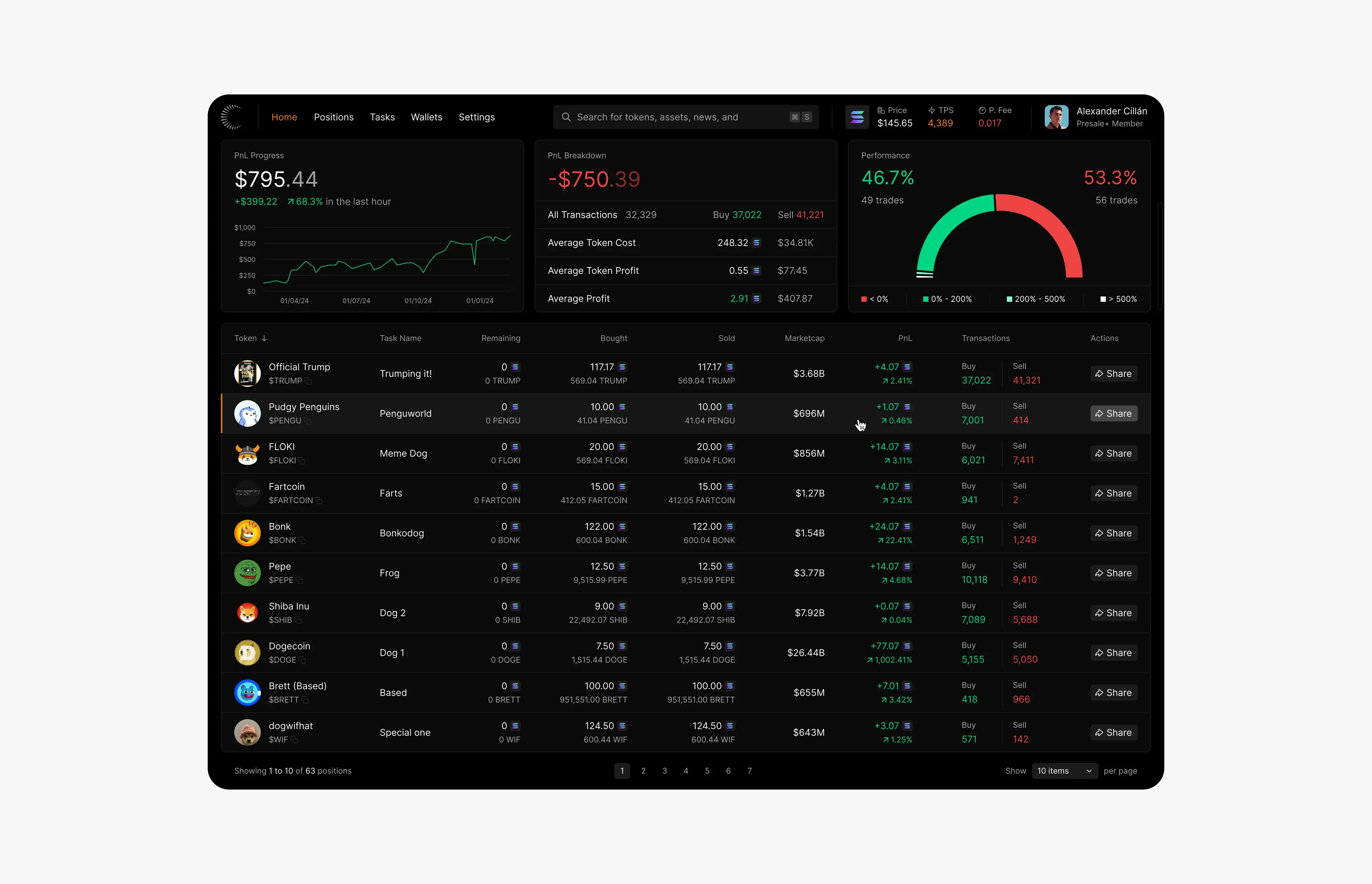
Article · October 3, 2026 · 6 min read
Dark mode for data-heavy products: contrast, readability and hierarchy
How to design dark mode for dashboards and data-heavy products: surfaces, contrast, color for gains and losses, type for numbers and a clear hierarchy.
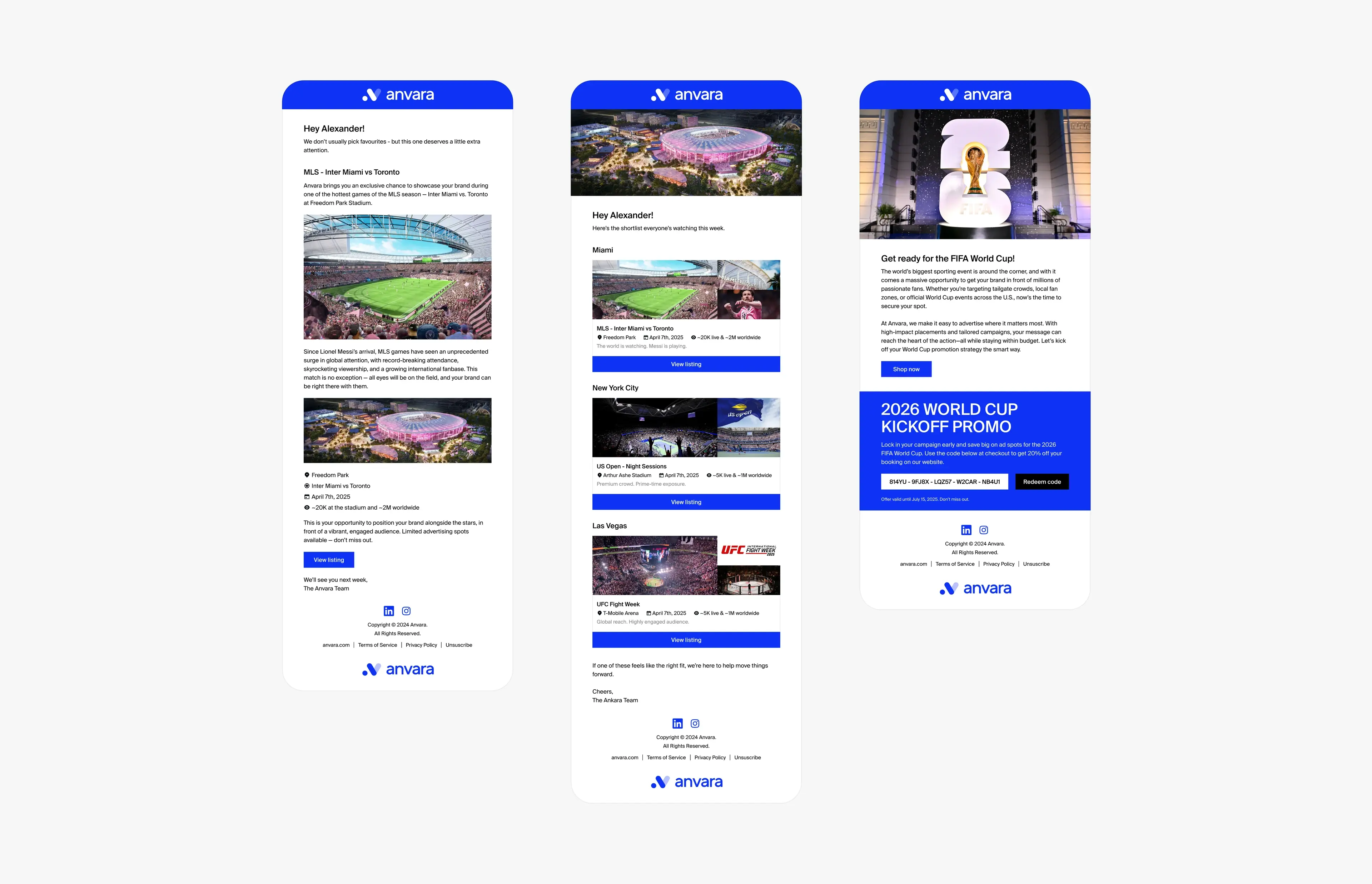
Article · October 15, 2026 · 5 min read
What it’s like to be a product designer at a seed-stage startup
What being a product designer at a seed-stage startup is really like: wearing many hats, shipping with a system, marketplaces, remote work and owning outcomes.