
ChromaAI: redesigning an AI content platform across 100+ screens
How I turned ChromaAI’s MVP into one cohesive creator platform: 100+ redesigned screens, a design system for 10+ AI tools and a 30-second launch video.
By Alexander Cillán · · 5 min read
- Client
- ChromaAI, AI content creation platform
- Based in
- United States
- Services
- UI/UX design, design system, website design, launch video
- Tools
- Figma, After Effects, Premiere Pro
- Timeline
- 8 weeks, spring–summer 2025
On this page· 7
ChromaAI is a platform for creators: one place to generate AI images and videos, add subtitles and voiceovers, and turn ideas into social-ready posts. Its mission is ambitious: anyone should be able to work like a professional content creator.
When the team reached out, the technology was already there. The experience wasn’t. The product worked, but it looked and felt like a functional MVP, and that undersold how powerful it really was. My job was to redesign the whole experience so the product looked as good as it worked.
The problem: ten tools that felt like ten products
Each AI tool had been built on its own, and it showed. Moving between them felt like switching apps. In the audit, the same issues came up on almost every screen:
- Weak layout and vertical rhythm, so pages felt crowded and hard to scan.
- Confusing button logic and inconsistent states.
- Visual differences between modules that should have felt like one product.
- Navigation without clear structure or priority.
- Typography that didn’t scale or guide the eye.
The result: users had to reorient themselves on every screen, which made the whole platform feel scattered and slow, even when it wasn’t.
The approach: a system first, then the screens
Redesigning 100 screens one by one would have produced 100 nice screens that still didn’t fit together. So I started with the structure every tool would share, and only then designed the screens on top of it. Four changes made the biggest difference.
1. One layout for every tool
I rebuilt the vertical layout on a stronger grid with a clear reading path: what the tool does, the input, the settings, the result. Every tool now follows the same layout language, so learning one means knowing them all.
2. Navigation that always tells you where you are
A fixed sidebar holds the tools where it’s useful, and a simplified top bar handles page-level actions. Tool names are clear and always visible. Users know where they are and what comes next.
3. Buttons, states and feedback you can trust
Buttons are unified across the product: primary actions use one bold color and consistent sizing. Hover states, loading indicators and tooltips are part of the system rather than added screen by screen. In an AI product, where generation can take a while, clear feedback is what makes the wait feel short.
4. A component library behind every module
From the Image Generator to Templates, every module uses the same components: cards, dropdowns, inputs, sliders, toggles and file uploaders. New tools can now be designed in days instead of starting from scratch.
The marketing site
The redesign also covered the website, so the journey from first visit to first creation feels like one product. The landing page leads with the promise, create viral content in minutes, not days, then walks through the tools, social proof and pricing, with a clear call to action at every step.
A 30-second launch video built from real UI
To explain the product quickly, I made a short animated launch video. Instead of abstract visuals, it shows the real interface and how someone actually uses it: a prompt or a file upload, then each major tool step by step, generating a video, adding subtitles and creating a social-ready post without editing skills.
Every animation is built from real UI components, so the video stays consistent with the product. Soft lighting and a little 3D depth add polish without making it feel like a different app. There’s no voiceover: clear visuals, snappy motion and bold text overlays tell the story, which also means it works muted, the way most people watch video online.
Results
- screens redesigned
- 100+
- AI tools on one UI system
- 10+
- launch video explaining the product
- 30 s
- from kick-off to launch-ready
- 8 weeks
ChromaAI now has a consistent, scalable system across the marketing site, the full dashboard and every tool, plus a launch video that shows what the product does in under a minute. The interface feels clean, modern and creator-first, with a clear path from landing page to first creation.
Lessons for AI and SaaS teams
- Fix the system before the screens. Shared layout, navigation and components are what make many features feel like one product.
- Design for waiting. AI generation takes time. Progress, previews and history are core screens, not edge cases.
- Show the real product. A launch video built from the actual UI sets honest expectations and doubles as onboarding.
Planning a redesign of your own product? Start with my SaaS redesign checklist.
Frequently asked questions
How long does a SaaS UI/UX redesign take?
ChromaAI took about eight weeks for 100+ screens, a design system, the marketing site and a launch video. A smaller product or a single flow can take two to four weeks; the biggest variable is how many tools and states need to be designed.
Should you redesign screen by screen or build a design system first?
System first. Agreeing on layout, navigation and core components early means every screen designed afterwards fits together, and new features are much faster to design and build.
What makes UX for AI products different?
Generation takes time and results vary, so loading states, previews, history, retries and clear credit or pricing information matter more than in most software. Good feedback makes the product feel faster and more trustworthy.
Why use the real interface in a product launch video?
It shows exactly what users will get, builds trust, and works as a quick product tour. Built from real UI components, it also stays consistent with the product as it evolves.
Keep reading
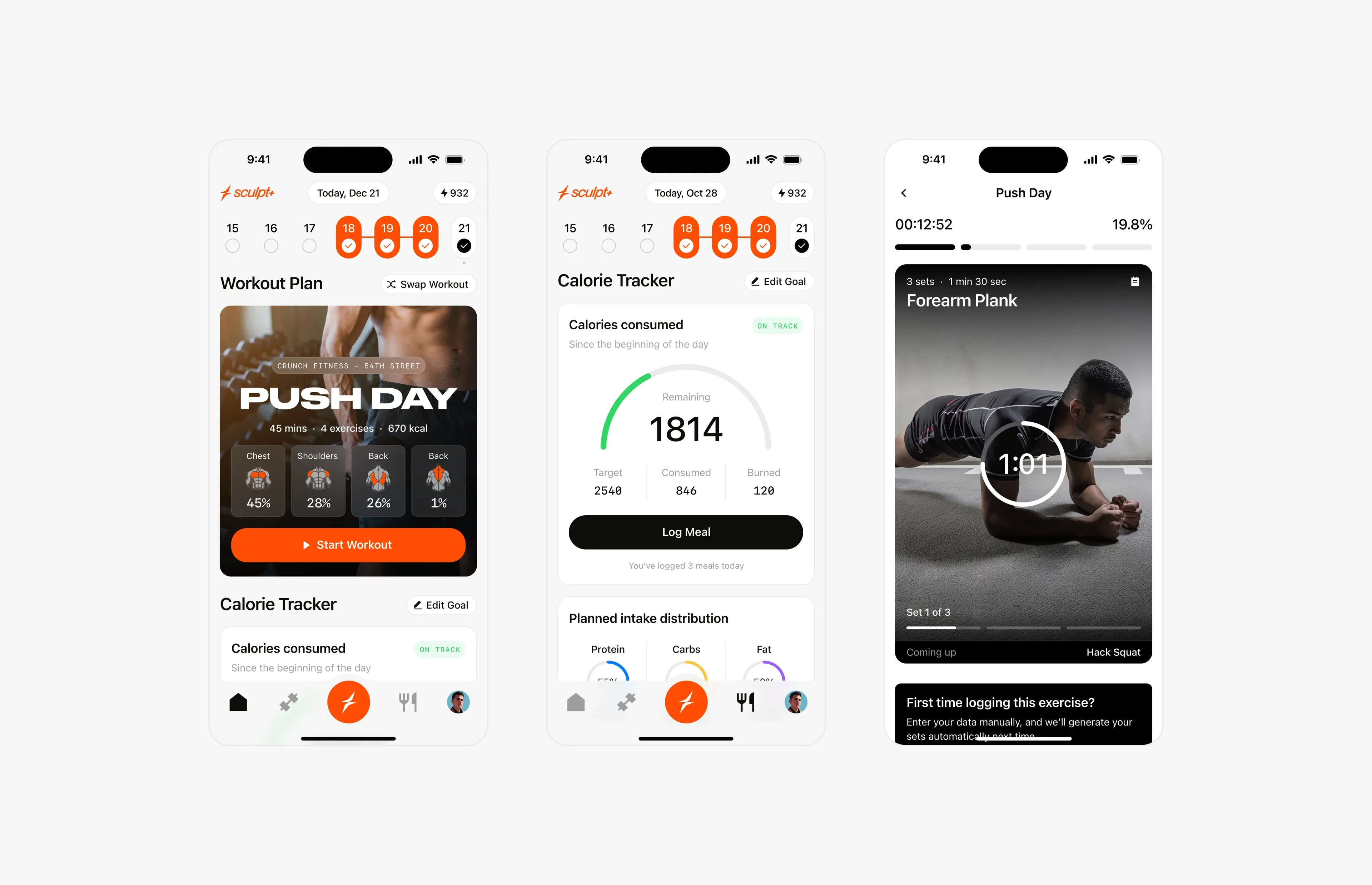
Case study · September 2, 2026 · 6 min read
Sculpt AI: brand, motion and 150+ screens for an AI fitness app
How I led the creative for Sculpt AI: a new brand identity, splash motion, a new user flow and 150+ screens for an AI app that unites workouts and food logging.
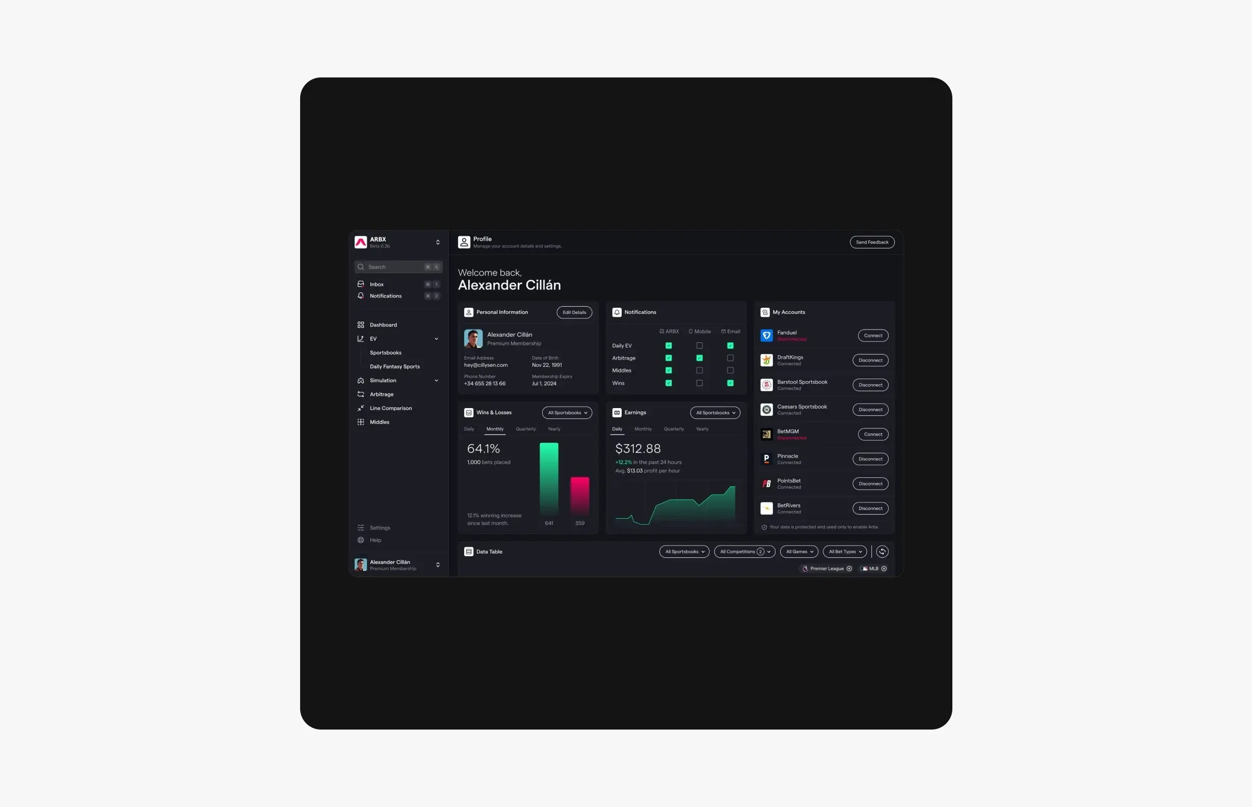
Case study · July 23, 2026 · 5 min read
ArbX: designing a sports analytics dashboard you can read at a glance
How I designed ArbX, a sports betting analytics SaaS: a dark dashboard you can read at a glance, a step-by-step simulator and an animated pricing grid.