
Bandar’s Bounties: a simpler logo and a website for a price-error community
A one-ink logo and a new website for Bandar’s Bounties, a premium Discord group for price errors: a direct hero, a playful pricing toggle and press proof.
By Alexander Cillán · · 6 min read
- Client
- Bandar’s Bounties, premium Discord deals group
- Based in
- United States
- Industry
- Online deals and price errors
- Services
- Logo redesign, website design, mobile design
On this page· 6
Bandar’s Bounties is a premium Discord group that helps people find online price errors and exclusive deals. Its audience is mostly between 16 and 35, and most of them are looking for a way to make some extra cash.
The brand had energy, but not clarity. The logo was vibrant but cluttered, and the website had to explain a fairly unusual product quickly, earn the trust of a skeptical audience and work just as well on a phone. I redesigned both.
A logo that does more with less
The original logo was vibrant, which suited the brand, but it was too complex. All that detail made it lose impact at small sizes and made it hard to reproduce consistently.
I streamlined it into a cleaner form that prints in a single ink. That’s a useful test for any logo: if it still works in one color, it will work as a Discord avatar, a favicon or a sticker. To keep the energy of the original, the vibrancy now comes from a modern gradient used across the brand, rather than from extra detail in the mark itself.
Simplifying an existing logo is often the right call for a brand that people already recognize. I did something similar for Timepiece FNF, and I explain how decisions like this shape a project in what goes into a brand identity.
A hero that says it straight
This audience doesn’t want vague promises about community. They want to know what they’ll get. So the hero headline is direct: it promises earnings from price mistakes, with a short line underneath explaining that members discover pricing errors, glitches and profit opportunities before they leak to the public.
Three things support that headline:
- A vibrant gradient that carries the new brand colors and gives the page its energy.
- Real examples of past wins. Below the buttons, a row of order confirmations and checkout screens shows the kind of deals members have found. It’s proof, not decoration.
- Clean typography and well-placed calls to action. One primary button to join, one secondary button to learn more, and nothing else competing with them.
Just below, an “As featured on” strip shows the logos of outlets that have covered the group, so trust starts building before the visitor even scrolls.
Pricing as a choice: the wrong one and the right one
Most pricing sections start with numbers. This one starts with a decision. The section opens with the headline “Decide your future today and transform your life”, and under it sits a two-way toggle: “The wrong choice” and “The right choice”.
The wrong choice is staying where you are. Select it and you see a single card listing what that looks like in practice: paying other groups that copy alerts, missing deals because they’ve already sold out, slow alerts, and orders canceled because you were too late. The button on that card simply says “Stay where you are”.
The right choice is picking a plan. Switch the toggle and the card is replaced by the membership passes, monthly and quarterly, each with its features listed underneath, on the same bright gradient as the hero.
Why it works for this audience:
- It’s playful. For a 16–35 crowd, a bit of humor feels native rather than salesy.
- It frames the real comparison. The alternative to joining isn’t another plan, it’s doing nothing. The toggle makes that visible.
- It keeps the section focused. Only one state shows at a time, so visitors weigh one idea instead of scanning a crowded grid.
The tone of a pattern like this needs care. It works here because the copy is clearly tongue-in-cheek and the plans are explained plainly. On a more serious product, the same trick would feel like pressure.
Testimonials and press, side by side
Trust is everything for a paid deals group. People need to believe the alerts are real and fast before they join. So the testimonials section, “Hear the buzz from our community”, mixes two kinds of proof in one grid:
- Member stories, each with a username, an avatar and how long they’ve been a member, in the members’ own words.
- Press highlights, set as larger cards: a quote from a Sportskeeda article about a pricing error, and a gradient card that links to a post on X.
Mixing them works better than separating them. Member stories bring authenticity; press brings credibility. Side by side, each makes the other more believable.
Every section, rebuilt for mobile
Around 60% of global web traffic comes from mobile, so every desktop element was optimized for mobile rather than just shrunk to fit. The headline, the deal examples, the pricing toggle, the testimonials and the FAQ all had to work with a thumb on a small screen.
Patterns that show one thing at a time translate naturally to a phone. The wrong choice / right choice toggle only ever shows one state, and the FAQ uses accordions, with two action cards above them for submitting a bounty and contacting support, so the page stays short until someone wants the detail.
You can see more projects like this in my case studies.
- is all the new logo needs to print
- 1 ink
- the age range of the target audience
- 16–35
- of global web traffic comes from mobile
- ~60%
Frequently asked questions
When should you simplify a logo instead of designing a new one?
When people already recognize the brand but the mark is too complex to reproduce well. Simplifying keeps what people know while making the logo work at small sizes and in one color, as with the Bandar’s Bounties redesign.
Why should a logo work in one color?
Because it will end up on avatars, favicons, merch and print, often small and sometimes in a single ink. A mark that holds up in one color stays recognizable everywhere, and color or gradients can be added around it for energy.
What is a ‘wrong choice / right choice’ pricing toggle?
A toggle that lets visitors switch between two states: what happens if they do nothing, and the plans they can choose. It frames pricing as a decision rather than a list of numbers. It suits playful brands and younger audiences, but feels pushy on serious products.
Should testimonials and press mentions go in the same section?
Often, yes. Customer stories bring authenticity and press brings credibility. Mixing them in one grid, with press highlighted in larger cards, makes both more convincing than keeping them apart.
How do you make a landing page work well on mobile?
Optimize every section for a small screen instead of shrinking the desktop layout. Patterns that show one thing at a time, like toggles and accordions, help keep the page short and easy to use with one thumb.
Keep reading
Case study · October 5, 2026 · 6 min read
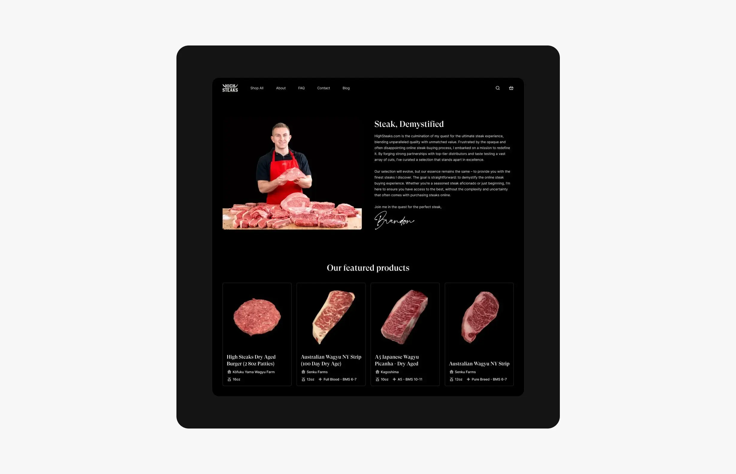
HighSteaks: branding and e-commerce for a creator-led butcher shop
How I refreshed HighSteaks’ knife logo and designed a mobile-first store that turns a New York butcher’s 150K+ social following into online customers.
Case study · June 28, 2026 · 4 min read
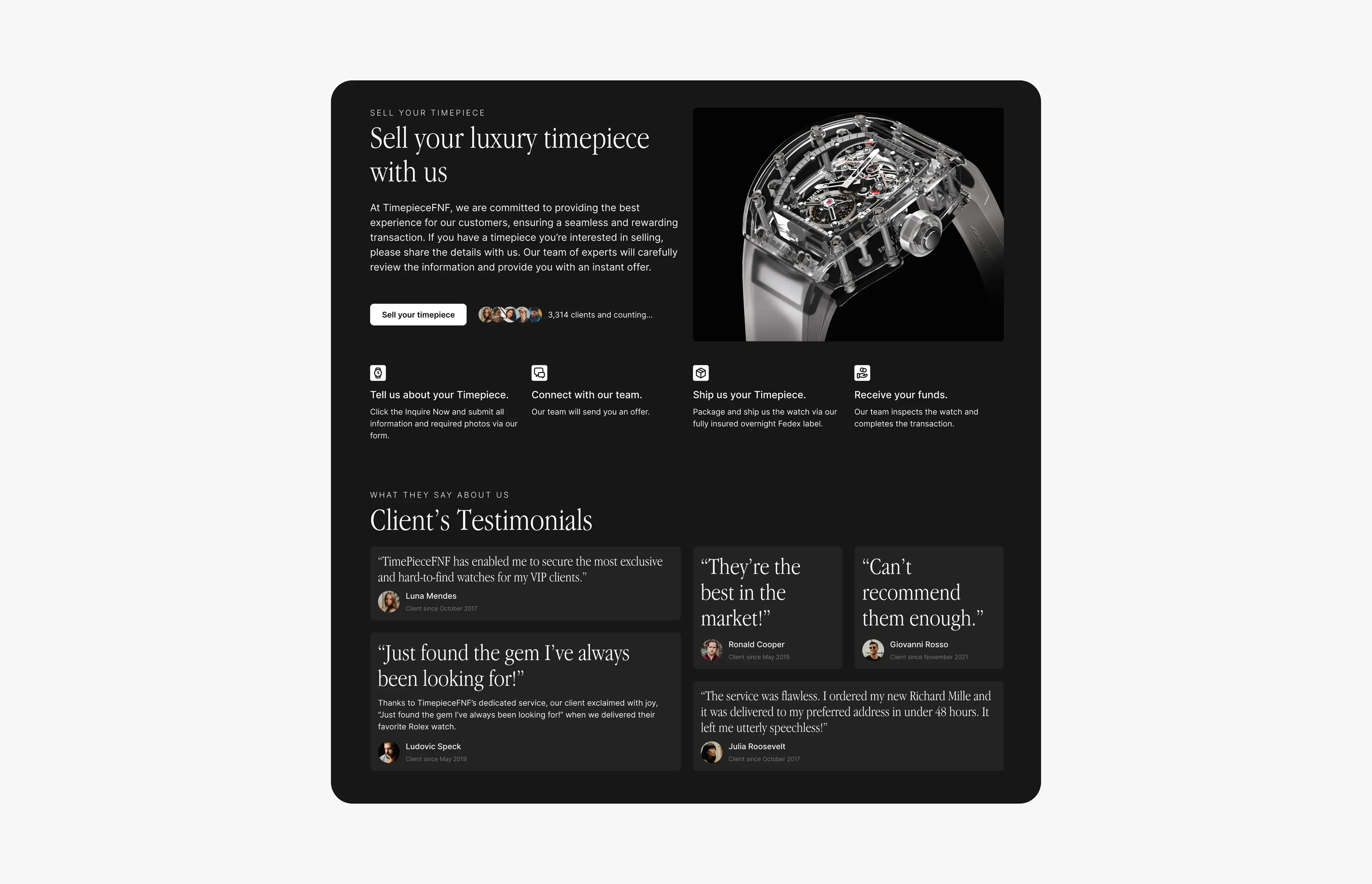
Timepiece FNF: luxury watch branding, website and a sell-your-watch platform
Brand refresh, a dark-mode website and a multi-step ‘sell your watch’ flow for Timepiece FNF, a luxury watch dealer group with $10M+ in verified sales.