
From desktop to mobile: designing complex interfaces without losing anything
How to take a dense desktop interface to mobile without cutting features: prioritizing, layering and collapsible menus, with examples from real product work.
By Alexander Cillán · · 6 min read
On this page· 7
A desktop screen gives you room for everything at once. A phone gives you a fraction of the width, a thumb instead of a mouse, and a user who is probably doing something else at the same time. The easy answer is to cut features until the mobile version fits. It’s usually the wrong one.
Around 60% of global web traffic comes from phones, so for many products the mobile version is the product. I’ve taken dashboards, booking apps and real-time interfaces from desktop to mobile, and the goal is always the same: keep everything the user needs, and change how and when they see it. Here’s how I approach it.
Start with an inventory, not a layout
Before drawing a single mobile frame, I list every element on the desktop screen: data, actions, navigation, social features, help text. Then I sort each one into three groups:
- Always visible. What the user needs to make the next decision. On most screens that’s two or three things, not ten.
- One tap away. Context that supports the decision but doesn’t have to compete with it: history, details, secondary stats.
- On demand. Settings, explanations and anything people use once a session.
Nothing gets deleted at this stage. The point is to decide when each element appears, not whether it exists. If the team can’t agree on what belongs in the first group, that’s a product question worth answering before any design work starts.
A real-time interface on a phone: the SolCrash roulette
One of the densest screens I’ve designed was a roulette concept for SolCrash, a crypto gaming product, back in 2022. On desktop, everything lived side by side: the betting options, the potential profit, the recent rolls, the list of players in the round and a live chat. Dark mode made the numbers and bets stand out, and the chat gave the product its social side.
On mobile there was no room to show all of that at once, and removing any of it would have changed the product. So I kept every piece and rebuilt the hierarchy around three ideas:
- A prioritized layout. The betting options and the potential profit come first, because they drive the next action. Whatever affects that action is never hidden.
- Smart layering. Supporting information sits on layers above the main view, so it can be checked without leaving the round.
- Collapsible menus. Recent rolls and the player list stay accessible in sections that open when needed, and the chat was adapted to mobile instead of being squeezed into a narrow sidebar.
The principle carries over to any real-time product, whether it’s a trading dashboard, a live auction or a sports app: users should be able to act without hunting for controls, and check the context without losing their place.
Five patterns that fit more into less
Most of the work comes down to a handful of well-known mobile patterns, used deliberately:
- Bottom sheets and overlays. Secondary content slides up over the main view and slides away again. The user never loses the screen they were on.
- Collapsible sections and accordions. Long lists, filters and FAQs fold down to one line each. Ideal for content people scan, then open one item at a time.
- Tabs and segmented controls. When two views matter equally, like players and chat, let the user switch between them instead of stacking them.
- Step-by-step flows. A desktop form with ten fields becomes five screens with two fields each. Every screen feels easy, and progress is always visible.
- A sticky primary action. The main button stays within thumb reach while the content scrolls underneath.
What I avoid: hiding core features behind a hamburger menu, shrinking desktop tables until the text is unreadable, and horizontal scrolling for anything that isn’t a carousel.
Splitting a feature-rich app across screens: Mylo and Godono
Some products are complex because they do a lot of things, not because one screen is dense. Mylo is a good example: an app for discovering and booking services, from a dental clinic to a spa. On a large screen you could show search, a business profile and a calendar in one view. On a phone, each becomes its own screen with one clear job: discover, decide, book.
The booking follows the step-by-step pattern. Choosing a service, picking a time slot and confirming happen one after another, ending on a clear “You’re all set!” screen, so the user always knows where they are and what’s left. I used the same idea for the Timepiece FNF sell-your-watch flow, where each screen asks for one thing.
Godono, an app for volunteering and donations, had a different challenge: a social feed, organization chat, events with maps, volunteer profiles and a donation flow. Here the home screen does the prioritizing, with featured causes first, and each of the other features gets its own focused screen. Short onboarding screens explain the idea before the app asks for anything.
Marketing sites: optimize every section, don’t drop it
The same thinking applies to websites. For Bandar’s Bounties, a community that helps members find online price errors and exclusive deals, every desktop element was optimized for mobile rather than removed: the hero with real examples of past wins, the pricing comparison, the testimonials and press, and the FAQ.
The sections that build trust are exactly the ones teams are tempted to cut on mobile, because they’re long. Instead, tighten them: fewer words per card, one column instead of a grid, and accordions for the FAQ so the page stays short until someone wants the detail. Mobile polish is also one of the luxury website design principles I rely on to make a site feel premium.
A checklist before you hand off the mobile design
- Every desktop element is either visible, one tap away or deliberately on demand.
- The main action on each screen is within thumb reach and never scrolls out of view.
- Numbers that drive decisions are never hidden behind a menu.
- Tap targets are at least 44 × 44 points, with enough space between them to avoid mis-taps.
- Text stays at a readable size; nothing is shrunk just to fit.
- Long content collapses, and the collapsed state still says what’s inside.
- Every layer and sheet has an obvious way to close it.
- Empty, loading and error states are designed for the small screen too.
- You’ve tested it on a real phone, with one hand.
If you’re planning a bigger overhaul, my SaaS redesign checklist covers the system side, and you’ll find more product work in my case studies.
Frequently asked questions
How do you convert a desktop design to mobile?
Start with an inventory of every element and rank each one by how much it matters to the next action. Decide what’s always visible, what sits one tap away and what appears on demand, then design the layout using patterns like bottom sheets, accordions, tabs and step-by-step flows.
Should the mobile version have fewer features than desktop?
Rarely. Users expect to do the same things on any device, and for many products most traffic is mobile. Keep the features and change the presentation: layer them, collapse them or split them across screens instead of removing them.
Should I design mobile-first or desktop-first?
For most consumer products, mobile-first, because it forces you to prioritize early. For data-heavy tools used mainly at a desk, I often start on desktop, but I plan the mobile hierarchy from day one so it never becomes an afterthought.
What is progressive disclosure in mobile design?
Showing only what the user needs right now and revealing the rest when they ask for it, through expandable sections, sheets or the next step in a flow. It keeps screens simple without removing any functionality.
Keep reading
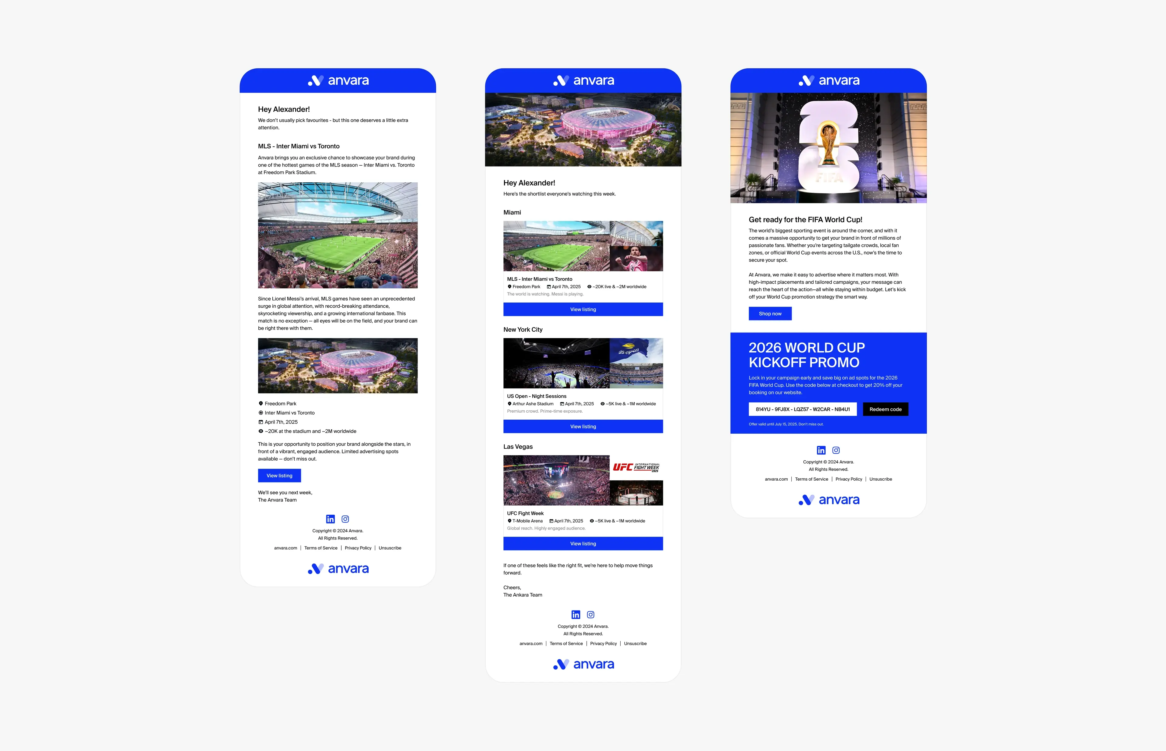
Article · October 15, 2026 · 5 min read
What it’s like to be a product designer at a seed-stage startup
What being a product designer at a seed-stage startup is really like: wearing many hats, shipping with a system, marketplaces, remote work and owning outcomes.
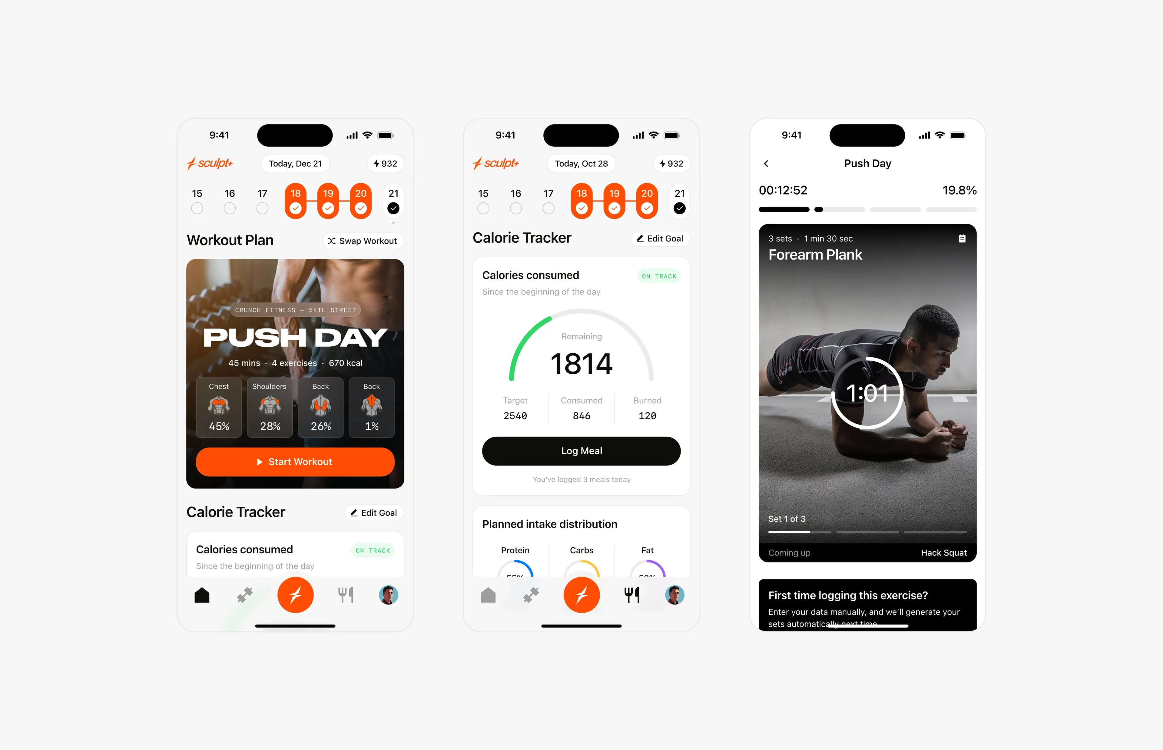
Article · October 6, 2026 · 6 min read
How to brief a designer for your startup’s app: what founders should prepare
What founders should prepare before briefing an app designer: mission, users, core journeys, scope, references and constraints, with a practical checklist.