
Mobile-first ecommerce design: what changes when most traffic is on a phone
When most shoppers arrive on a phone, the store has to be designed for the thumb first: product cards, cart drawers, layout and speed, with real examples.
By Alexander Cillán · · 6 min read
On this page· 8
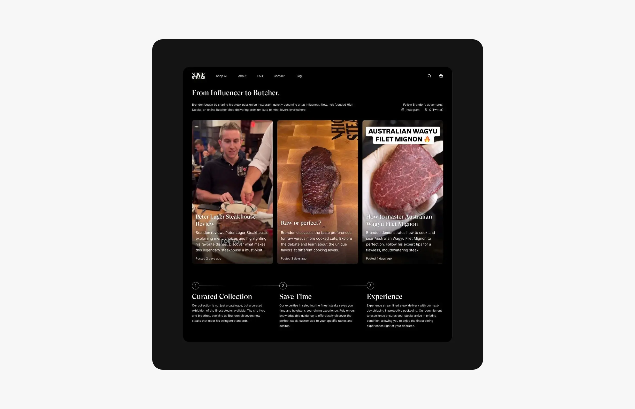
When I designed the online store for HighSteaks, a premium butcher shop from New York, one number shaped every decision: we expected more than 90% of visitors to arrive on a phone. Its founder, Brandon Alwadish, has more than 150K followers across Instagram and TikTok, and that’s where the shoppers come from. They tap a link, land on the store mid-scroll and decide in seconds whether to stay.
Mobile-first doesn’t mean shrinking a desktop site until it fits. It means designing for the phone first, then using the extra space on desktop. Here’s what changes when you work that way.
Start with where your traffic comes from
Visitors from social media behave differently from visitors who searched for you. They’re in what I call “scroll and shop” mode: one hand, one thumb, short attention, often inside the Instagram or TikTok browser rather than Safari or Chrome. They didn’t plan to shop. You have to earn the next tap.
Even without a social audience, the phone is usually the main screen. For Bandar’s Bounties, a premium Discord group that helps people find online price errors and exclusive deals, I optimized every desktop element for mobile, because around 60% of global web traffic is mobile.
Before designing anything, I answer four questions:
- Where do visitors come from: social, search, email or ads?
- What do they want to do in the first ten seconds?
- How many will browse inside an in-app browser?
- What do they need to see before they trust you with their card?
Product cards that answer the question at a glance
On a phone, the product card does most of the selling. Shoppers scan a grid quickly, and every card has to tell them whether it’s worth a tap. For HighSteaks, each card shows the product name, the farm source, the weight and the price at a glance. For premium meat, those four facts are what people compare, so none of them sits behind a tap.
The rules I follow for mobile product cards:
- One image, one style. Same angle, same light and same background across the catalog, so the grid feels calm and products are easy to compare.
- Short names. Two lines at most. Put variants and details on the product page.
- The deciding details. For meat it’s source and weight; for fashion it might be sizes in stock. Show what actually decides the purchase.
- Price always visible. Hiding it only adds a tap and a doubt.
- The whole card is tappable, and any add-to-cart button is at least 44 by 44 points, Apple’s minimum for touch targets.
A cart drawer instead of a cart page
Every time you send a mobile shopper to a new page, you risk losing them: another load, a lost scroll position, a moment to reconsider. On HighSteaks, the cart is a drawer. It slides in from the right, dims the page behind it, shows the items alongside recommended products, and closes with a tap. Nobody has to leave the page they were browsing.
If you use a cart drawer, get the details right:
- Keep checkout visible. The main button should be on screen without scrolling, even with several items.
- Make quantities easy to change with large plus and minus controls, not a tiny dropdown.
- Recommend a little, not a lot. Two or three products that go with what’s already in the cart.
- Offer several ways to close it: a clear close button, a tap on the dimmed page and, ideally, a swipe.
- Make it accessible. Move focus into the drawer when it opens and back when it closes, so it works with screen readers too.
Bring the social proof into the store
When people arrive from a video, the store should feel like a continuation of it. HighSteaks has a section with snippets of Brandon’s Instagram and TikTok content, next to three short value points: “Curated Collection”, “Save Time” and “Experience”. The About section tells his story, signed by him, and the featured cuts appear on a clean dark background with the farm source, weight and quality grade.
On a phone, that content has to be light. Keep video snippets short, never autoplay with sound, and make any carousel obviously swipeable by letting the next card peek in from the edge.
Layout rules for thumbs
- Put primary actions within reach, in the lower half of the screen, where the thumb rests.
- Use one column. Horizontal carousels are fine for related products, not for the main catalog.
- Collapse the secondary content. Specs, shipping and FAQs work well as accordions, so the page stays short but nothing is lost.
- Add a sticky add-to-cart bar on long product pages, so the action never scrolls out of view.
- Design forms for phones: the right keyboard for each field, autofill switched on, and input text of at least 16 pixels so iOS doesn’t zoom in.
- Ask one thing at a time in longer flows. On Timepiece FNF, the sell flow asks for the brand, then the model, then photos, one step per screen.
Speed is a mobile feature
A phone on a patchy connection is far less forgiving than a laptop on office Wi-Fi. Compress every image and serve modern formats like WebP or AVIF. Load images and videos below the fold only when they’re about to be seen. Be strict with third-party scripts: each chat widget, tracker and pop-up adds weight. And test on a real mid-range phone over mobile data, not just in your browser’s device preview.
Then design the desktop version
Once the phone experience works, desktop is about using the extra space well: more products per row, details side by side with the photos, hover states and richer storytelling. It’s much easier to add than to take away. On Timepiece FNF, many collectors browse on their phones, so every layout was designed mobile-first, and the desktop pages grew from there. I cover the rest of that approach in luxury website design principles.
Frequently asked questions
What does mobile-first mean in ecommerce design?
It means designing the store for a phone screen first, deciding what matters most in a narrow column, and then expanding the layout for tablets and desktops. It usually leads to clearer product cards, shorter pages and simpler checkouts on every device.
Is a cart drawer better than a cart page on mobile?
For most stores, yes. A drawer keeps shoppers on the page they were browsing, confirms what they added and shows the checkout button straight away. A full cart page still makes sense for large orders or complex products with many options.
How big should buttons be on a mobile store?
Apple recommends touch targets of at least 44 by 44 points, and Google suggests 48 by 48 density-independent pixels. Leave enough space between targets so people don’t tap the wrong one.
How do I know how much of my traffic is mobile?
Check the device report in your analytics tool, and look at it by traffic source. Visitors from Instagram or TikTok are almost always on phones, so a social-led brand can expect a much higher mobile share than the average.
Do I need an app, or is a mobile website enough?
For most stores, a fast mobile website is enough and easier to reach, especially from social links. An app makes sense when customers buy often and you have features that benefit from it, like reordering or notifications.
Keep reading
Article · September 19, 2026 · 6 min read
Designing for creator-led brands: how to turn an audience into customers
How to design a brand and store for a creator-led business: logo, founder story, social content, mobile-first UX and the cart, with HighSteaks as the example.
Article · September 30, 2026 · 6 min read
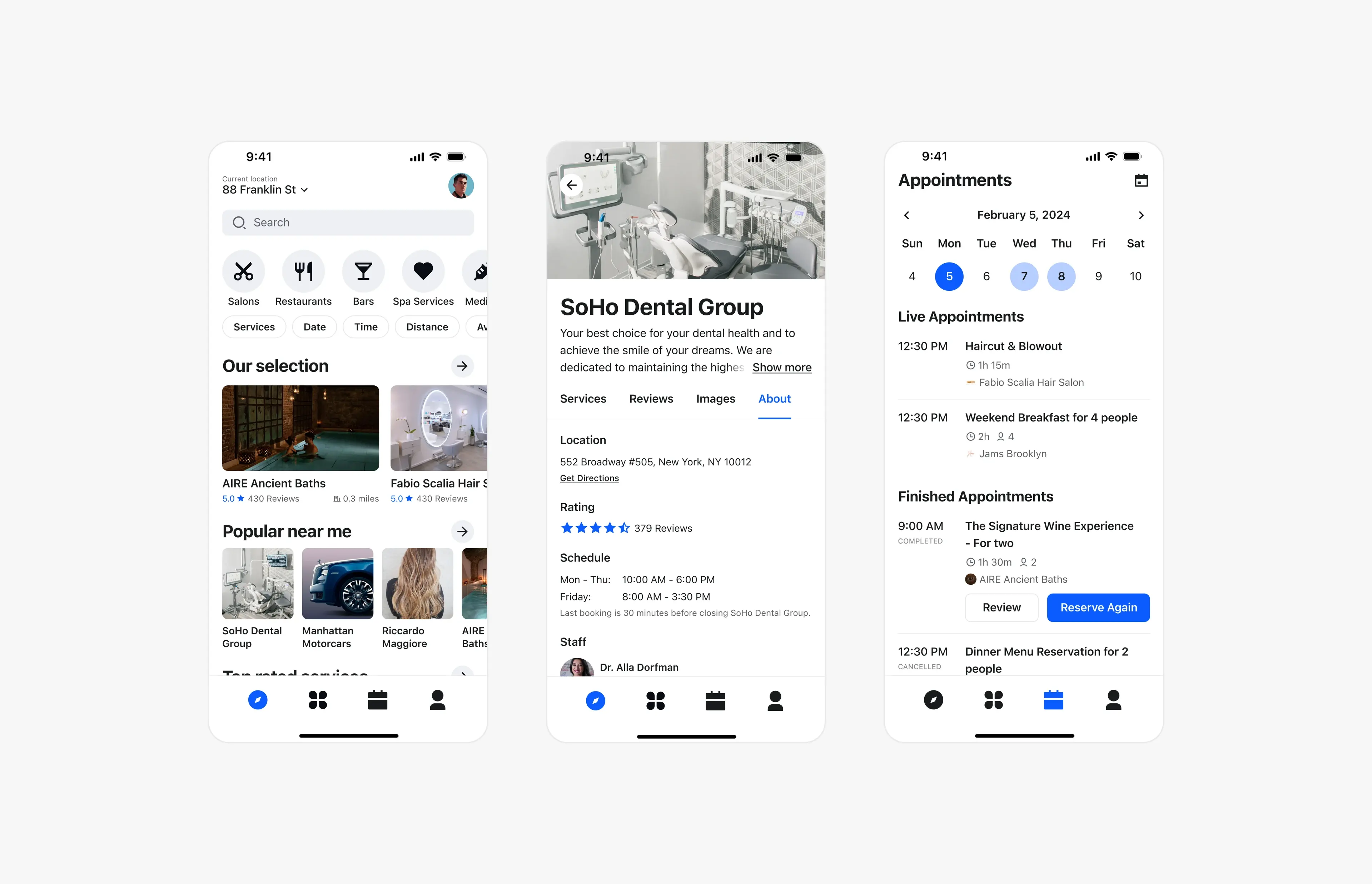
From desktop to mobile: designing complex interfaces without losing anything
How to take a dense desktop interface to mobile without cutting features: prioritizing, layering and collapsible menus, with examples from real product work.