
Pricing page UX: patterns that help people decide without pushing them
Pricing page design patterns that build confidence instead of pressure: clear plans, honest comparisons, reassurance and subtle motion, with real examples.
By Alexander Cillán · · 6 min read
On this page· 8
The pricing page is where interest turns into a decision, so it’s tempting to fill it with countdown timers, “only 2 left” badges and small print. Those tricks can lift clicks once. Then they cost you trust, refunds and reviews.
The pricing pages I design try to do the opposite: make the decision so clear that pressure isn’t needed. Here are three patterns from recent projects, ChromaAI, ArbX and Bandar’s Bounties, and the principles behind them.
What people need before they decide
Every visitor on a pricing page is quietly asking the same questions:
- What exactly do I get?
- Which plan is for someone like me?
- What happens after I click?
- Can I leave if it’s not for me?
- Is it worth it compared with what I do today?
A good pricing page answers all five without making people scroll, hover or open a chat. Most of the patterns below are simply ways of answering them faster.
Pattern 1: plans described by who they’re for (ChromaAI)
For ChromaAI, an AI content platform for creators, the pricing section offers three plans: a free one, Creator and Professional. Each card opens with one line about who it’s for: “For those just getting started”, “Built for consistent content” and “Serious tools for serious work”. People pick a plan by recognizing themselves, not by decoding a feature list.
A few details do a lot of the work:
- The same rows in the same order on every card, so you can compare credits, video length, editing and quality line by line.
- A quieter button for the free plan and filled buttons for the paid ones, so the hierarchy is clear without hiding the free option.
- A headline that frames the value against the real alternative, hiring a video editor, rather than against competitors.
- Reassurance under the cards: a free trial, cancel anytime and no credit card required. It answers the last doubt right where the decision happens.
Primed Proxies shows a related idea. Next to the plan card sits a short explainer, “What is a Server?”, with four key benefits, and below it a line for larger customers to book a call with sales. Explaining the product beside the price removes a reason to leave the page, and the sales line gives big buyers a path without cluttering the plans.
Pattern 2: motion that supports, not shouts (ArbX)
ArbX is a sports betting analytics SaaS with a sleek dark theme. For its pricing section, I designed a continuous grid effect with subtle animation and opacity shifts. It gives the page a futuristic feel that matches the rest of the product, and the layout makes it easy to see exactly what you get.
If you add motion to a pricing page:
- Keep it in the background. Never animate the prices or the feature lists people are trying to read.
- Make it slow and continuous, not a burst that pulls the eye away from the plans.
- Respect reduced motion. If someone has turned animations off in their system settings, show a still version.
- Keep it light. A heavy animation that slows the page down undoes everything it adds.
Pattern 3: a choice toggle that shows the trade-off (Bandar’s Bounties)
Most pricing toggles switch between monthly and yearly billing. For Bandar’s Bounties, a premium Discord group that helps people find online price errors and exclusive deals, the toggle does something different. It switches between “The wrong choice” and “The right choice”, under the headline “Decide your future today and transform your life”.
The right choice shows the two passes, monthly and quarterly, with the quarterly discount underlined by a hand-drawn stroke. The wrong choice shows a single card called “Stay where you are”, listing what you miss out on: slow alerts, deals that sell out before you see them and orders canceled because you were late.
The audience is aged 16 to 35 and looking to make extra cash, so a bold, playful tone fits. And it doesn’t feel pushy, for three reasons:
- The visitor is in control. They choose to flip the toggle; nothing pops up or blocks the way out.
- It’s tongue-in-cheek. The tone is light, not guilt-tripping.
- The downsides are real. With price errors, speed really is the product, so the comparison describes what the service actually solves.
That’s the difference from confirmshaming, the “No thanks, I don’t like saving money” link on a pop-up. One invites people to explore a comparison; the other guilts them on the way out. For a B2B tool or a more serious audience, I’d use a plain comparison table instead.
Principles that keep a pricing page honest
- Show the price. “Contact us” only makes sense for genuinely custom enterprise deals.
- Highlight one plan at most, and only call it “most popular” if it is.
- Make billing differences obvious. If yearly is cheaper, show the saving clearly and say when people will be charged.
- Put reassurance next to the button: trials, cancellation, refunds and whether a card is needed.
- Answer objections right below the plans with a short FAQ.
- Bring social proof close to the decision. Bandar’s Bounties places real member stories and press articles near the plans.
- No fake timers, no pre-ticked extras and no fees that only appear at checkout.
Pricing on mobile
On a phone, plan cards stack, and the comparison disappears off-screen. Keep each card short, keep the feature rows identical so people can scroll and compare, and make the plan names and buttons large enough to tap. For long comparison tables, a switcher that shows one plan at a time usually works better than a table people have to scroll sideways.
Measure, then adjust
Track clicks per plan, how far people scroll and which FAQ questions get opened. Then ask new customers what nearly stopped them from signing up. Their answers belong on the page. If you’re redesigning the product too, my SaaS redesign checklist covers the rest.
Frequently asked questions
How many plans should a pricing page have?
Usually two to four. Three is common because it gives an entry option, a main plan and one for heavier users, without making the choice hard. Fewer plans with clear differences beat many plans that look alike.
Should I show prices on my website?
In most cases, yes. Hidden prices make people assume the worst and leave. Keep “contact us” for genuinely custom deals, and offer it alongside your published plans rather than instead of them.
Should I highlight a recommended plan?
Highlighting one plan helps people decide faster, as long as it really suits most of your customers. Use one highlight only, and don’t label a plan “most popular” unless it is.
What is confirmshaming?
It’s a dark pattern where the option to decline is worded to make people feel stupid or guilty, like “No thanks, I don’t want to grow my business”. It may get a few extra clicks, but it damages trust in the brand.
Should pricing default to monthly or yearly billing?
Default to the option most customers choose, and make the other one easy to see. If yearly is the default, show the per-month equivalent and the total clearly, so nobody is surprised by the charge.
Keep reading
Article · October 3, 2026 · 6 min read
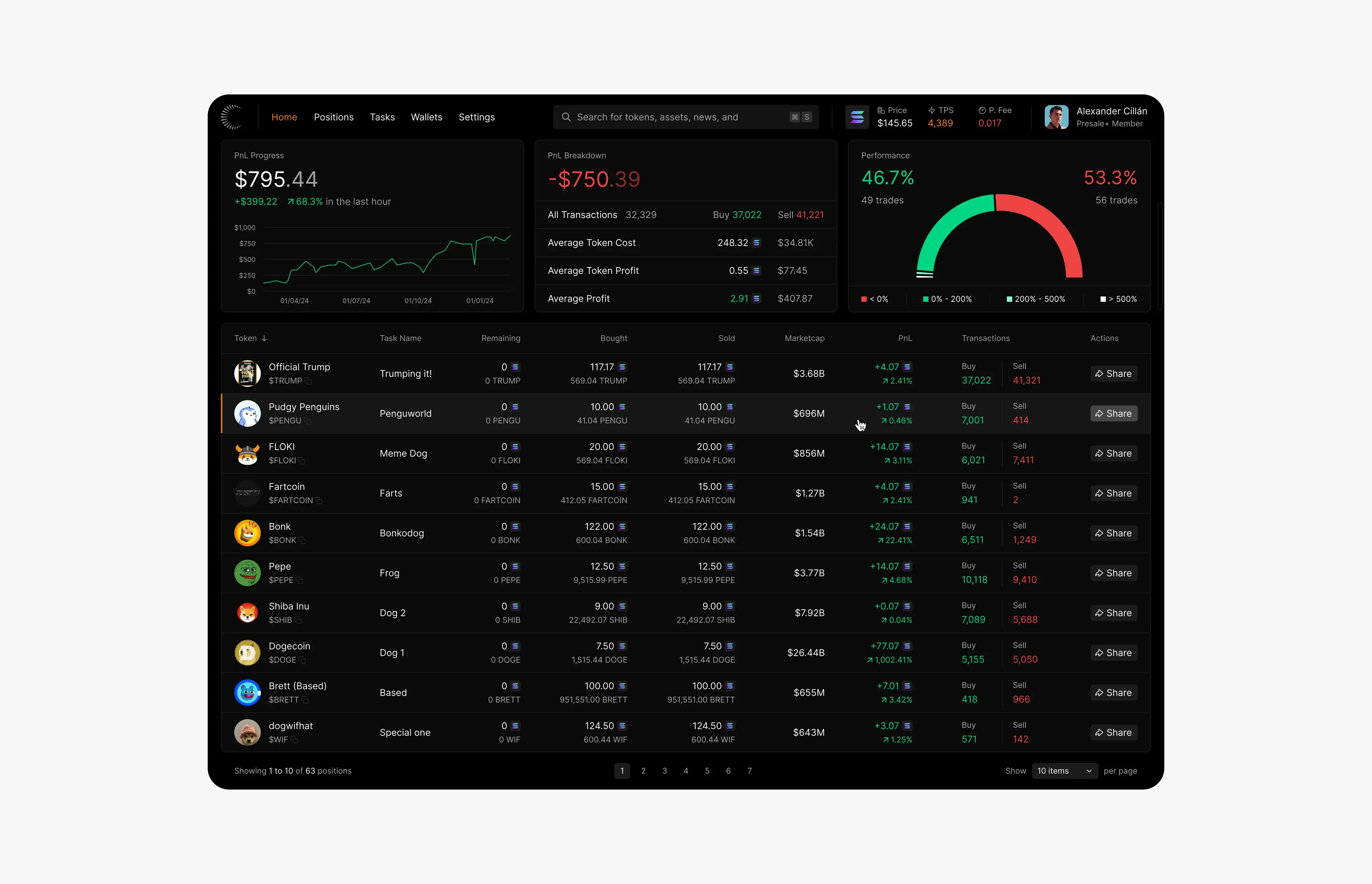
Dark mode for data-heavy products: contrast, readability and hierarchy
How to design dark mode for dashboards and data-heavy products: surfaces, contrast, color for gains and losses, type for numbers and a clear hierarchy.
Article · July 20, 2026 · 3 min read
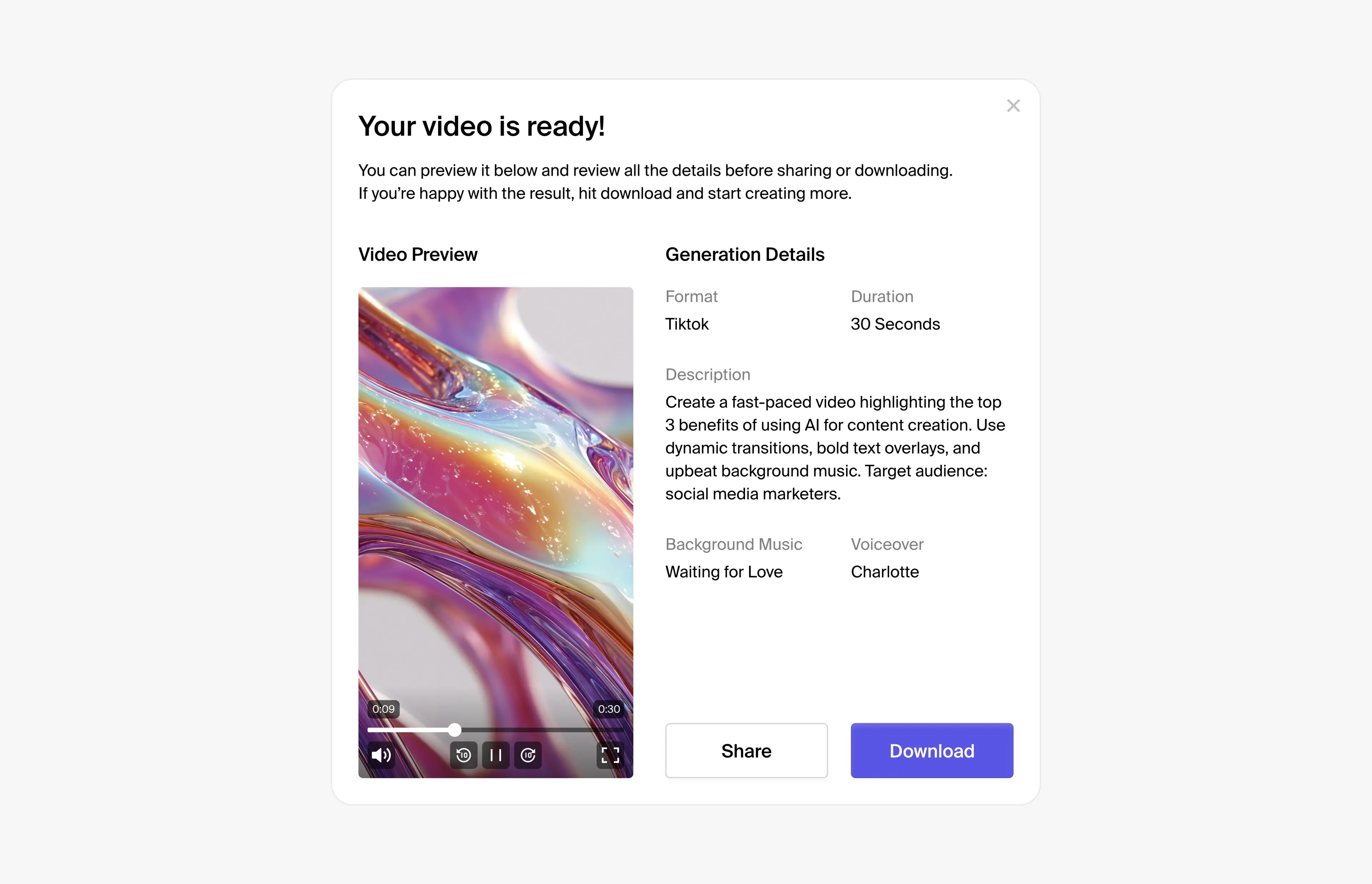
Redesigning a SaaS product: a 12-point UI/UX checklist
A practical UI/UX checklist for redesigning a SaaS or AI product, from the audit and navigation to states and design systems, based on redesigning 100+ screens.